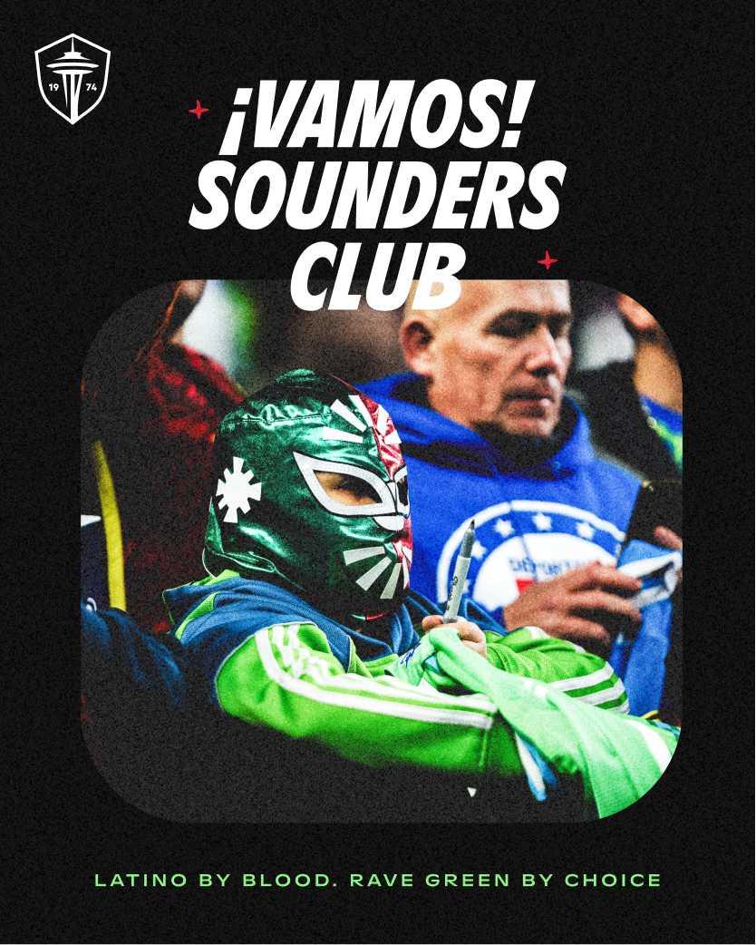
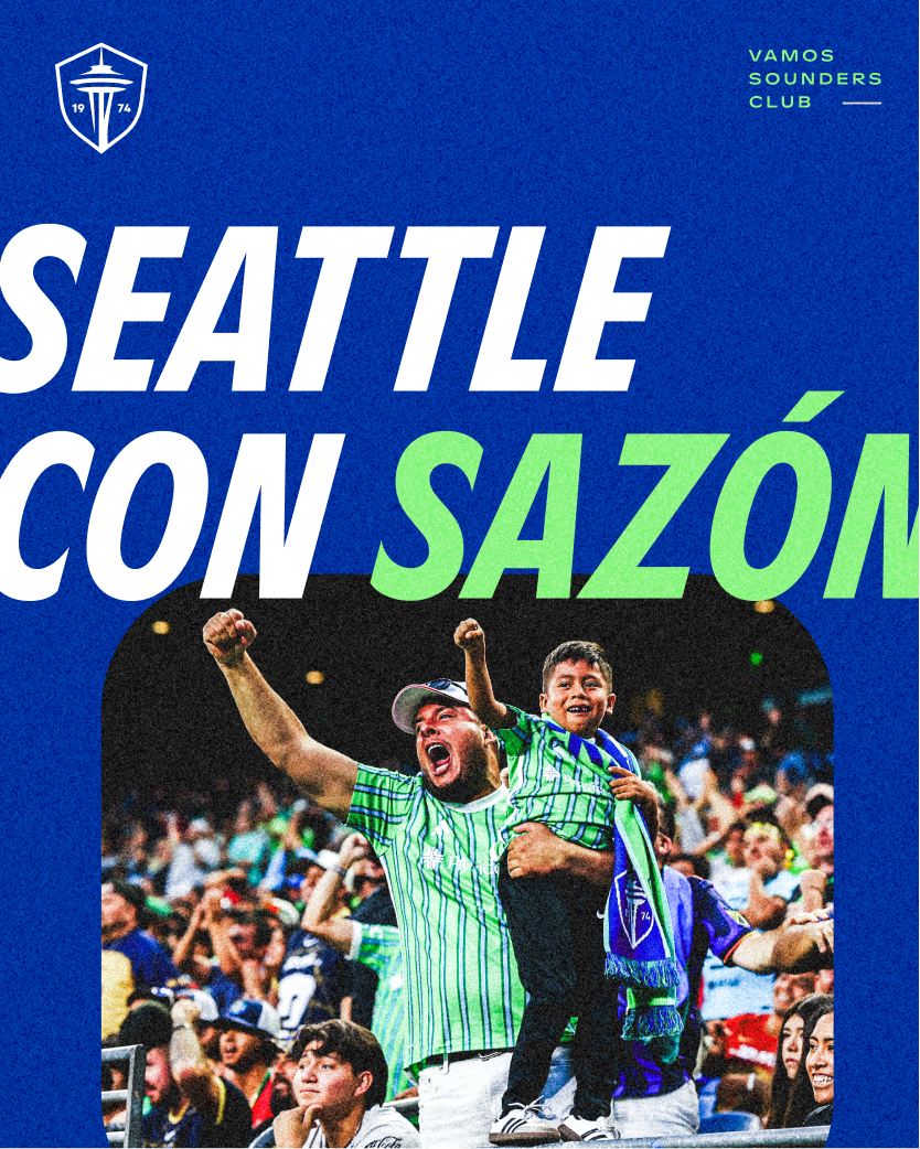
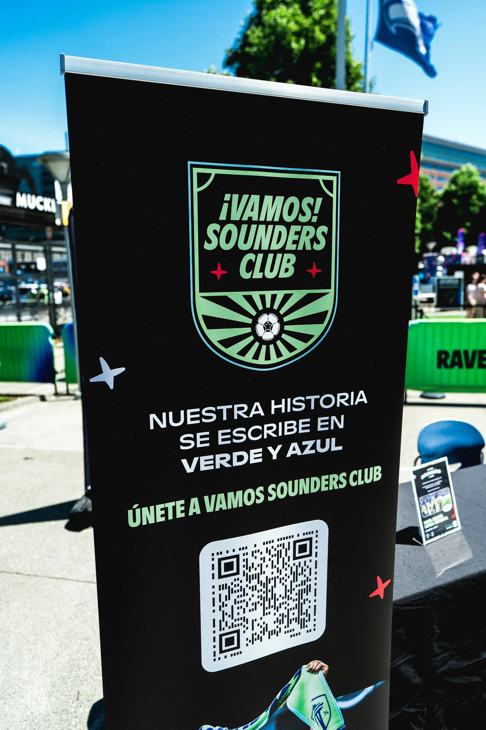
¡VAMOS! SOUNDERS CLUB
During the 2025 season, I was brought into a project that would become a meaningful moment in the club’s history. It was a bold effort to deepen our connection with the Latino community, and I was trusted to lead the development of the brand identity for a new Seattle Sounders FC community group. Working within our established brand guidelines, I guided the creative direction toward a unique expression—one that felt authentic, proud, and genuinely welcoming, while staying true to the club’s core identity.
CLIENT
Seattle Sounders
ROLE
Lead Designer
YEAR
2025
TYPE
Brand Identity
Strategic Approach
🎯 OBJECTIVE
The goal was to create a true home for the Latino community within the club—a space rooted in belonging, where culture and traditions are celebrated and where Latino fans could see themselves reflected. From a design standpoint, that meant building a brand identity that felt authentic and intentional, while also being flexible and scalable for long-term growth.
⚡CHALLENGE
This was new territory for the club. There wasn’t a clear playbook, which brought a lot of creative freedom—but also the responsibility to stay true to who the Sounders are and how the brand shows up. On top of that, the timeline was tight. The organization wanted to launch during the FIFA Club World Cup, using the biggest football moment in the city as the stage to introduce this new community group.
🚀 APPROACH
I led the creative direction by grounding the work in both culture and context. We went back to the roots—reflecting on what it means to be Latino and the elements that bring pride, identity, and connection. From there, we landed on the 1970s as the foundation for the visual direction—a golden era of football. Pelé at his peak, the 1970 World Cup in Mexico, and the early beginnings of our own club in 1974. That era felt authentic, timeless, and meaningful, and it became the backbone of how the identity came to life.
Essence
Vamos Sounders is the start of something bigger: a long-term home for Latino fans within the Sounders FC family. A place where fútbol culture thrives, traditions are honored, and everyone feels they belong. Because here, we don’t just say Vamos Sounders—we live it.
Passion, Energy, Belonging, Fun
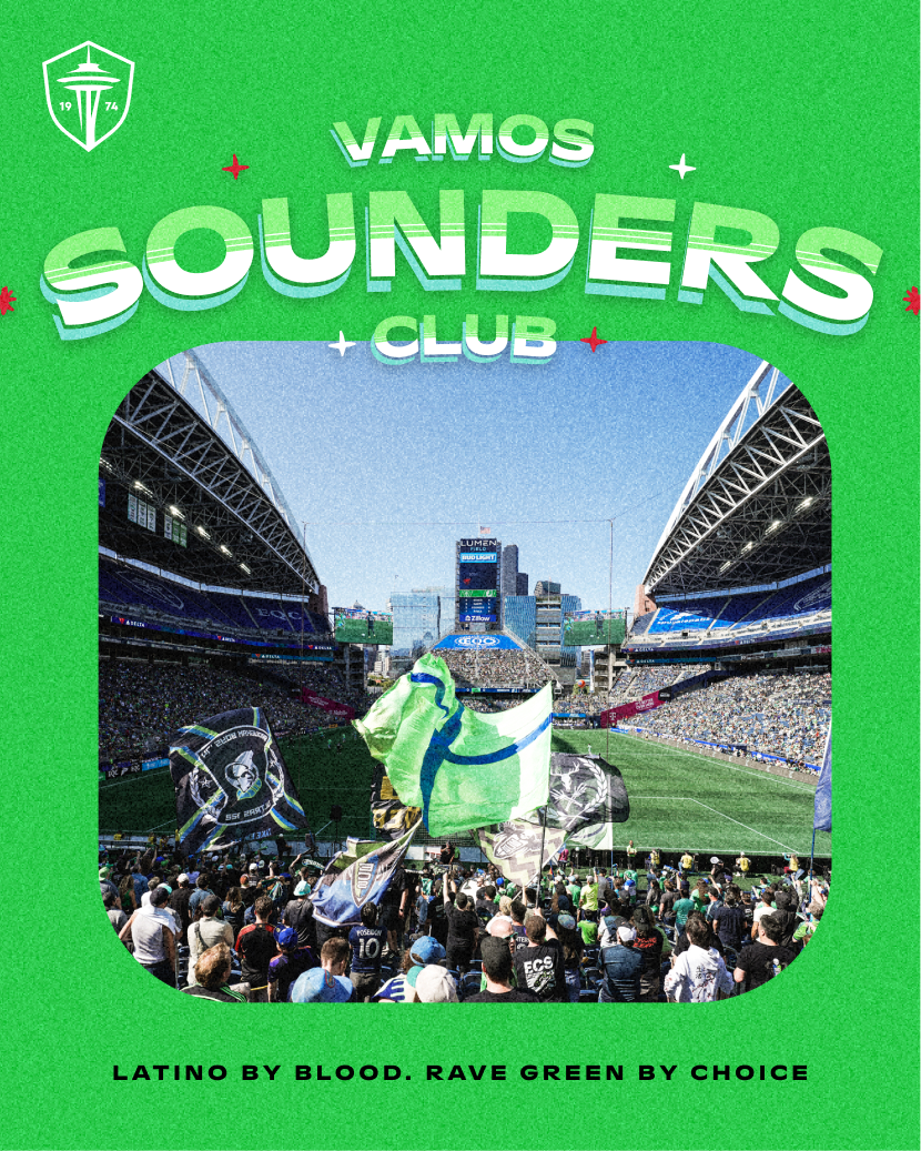
Seattle con sazón 🔥 Rave green desde la cuna. Latino by blood. Rave Green by choice 💚
Seattle con sazón 🔥 Rave green desde la cuna. Latino by blood. Rave Green by choice 💚
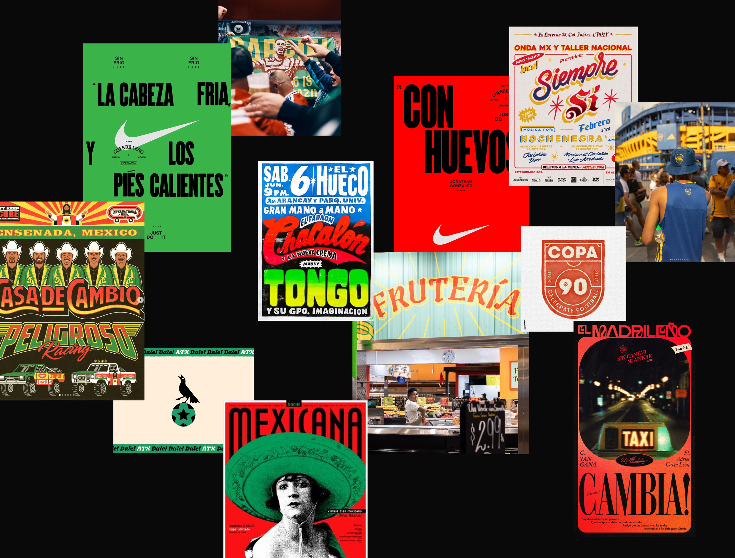
Exploration
We went back to our roots—our fútbol heritage passed down through generations, the vibrant colors we grew up around, the neighborhood bodegas and grocery stores that always felt like home. We looked to Mexican art, Argentinian fútbol culture, and popular cartelismo as reference points. All of it carries the essence of our lineage and what it truly means to be Latino. These influences shaped our creative process and became the foundation for the expression we were building for this club.
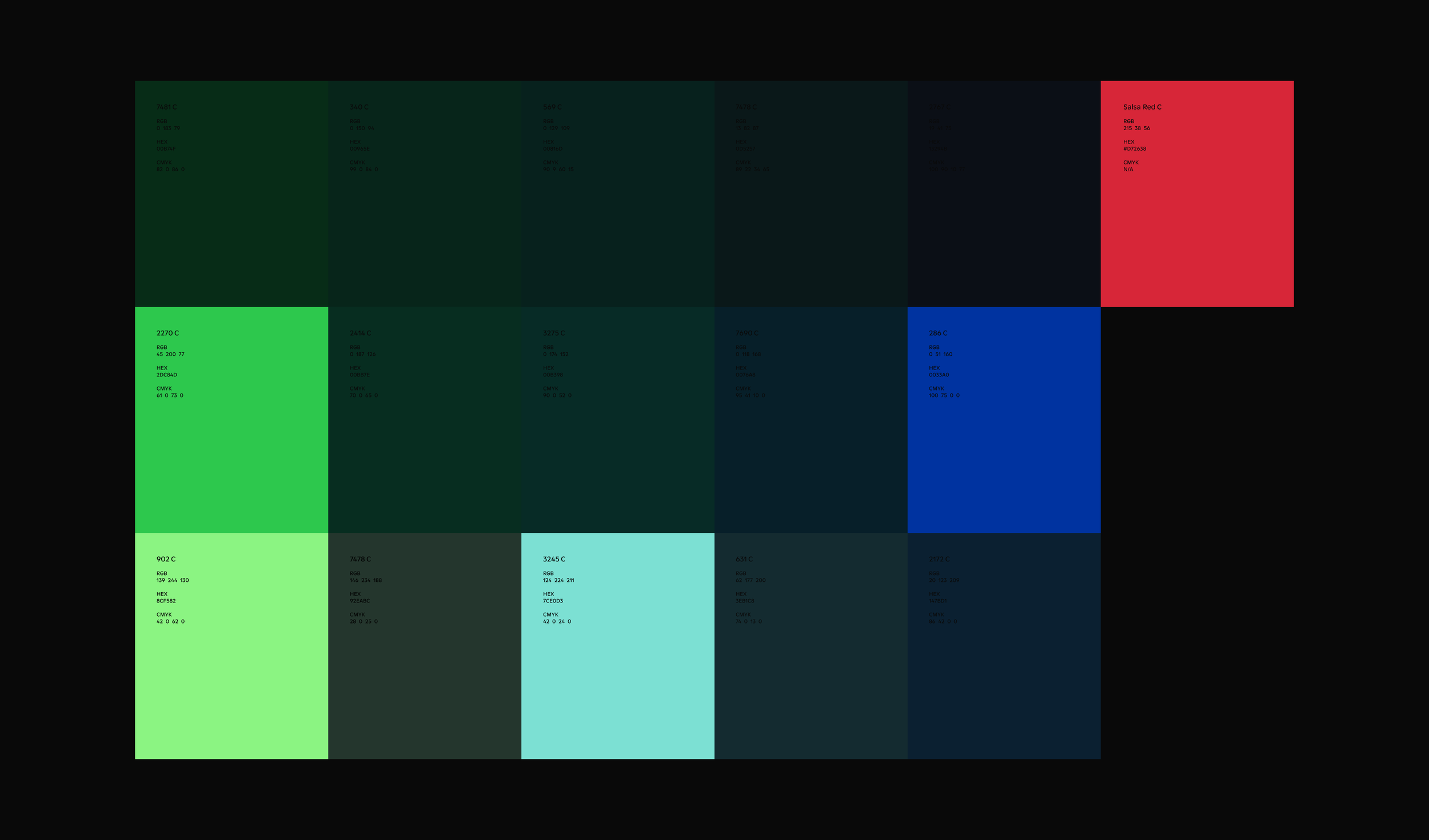
Color Palette
Color became a key part of how we signaled uniqueness for this club. For the first time, the organization introduced a new color into the Sounders FC palette—one created specifically for this community. It was designed to live alongside the core brand while standing on its own, acting as a clear visual identifier for fans. Salsa Red joined the party, bringing with it that unmistakable Latino sazón.
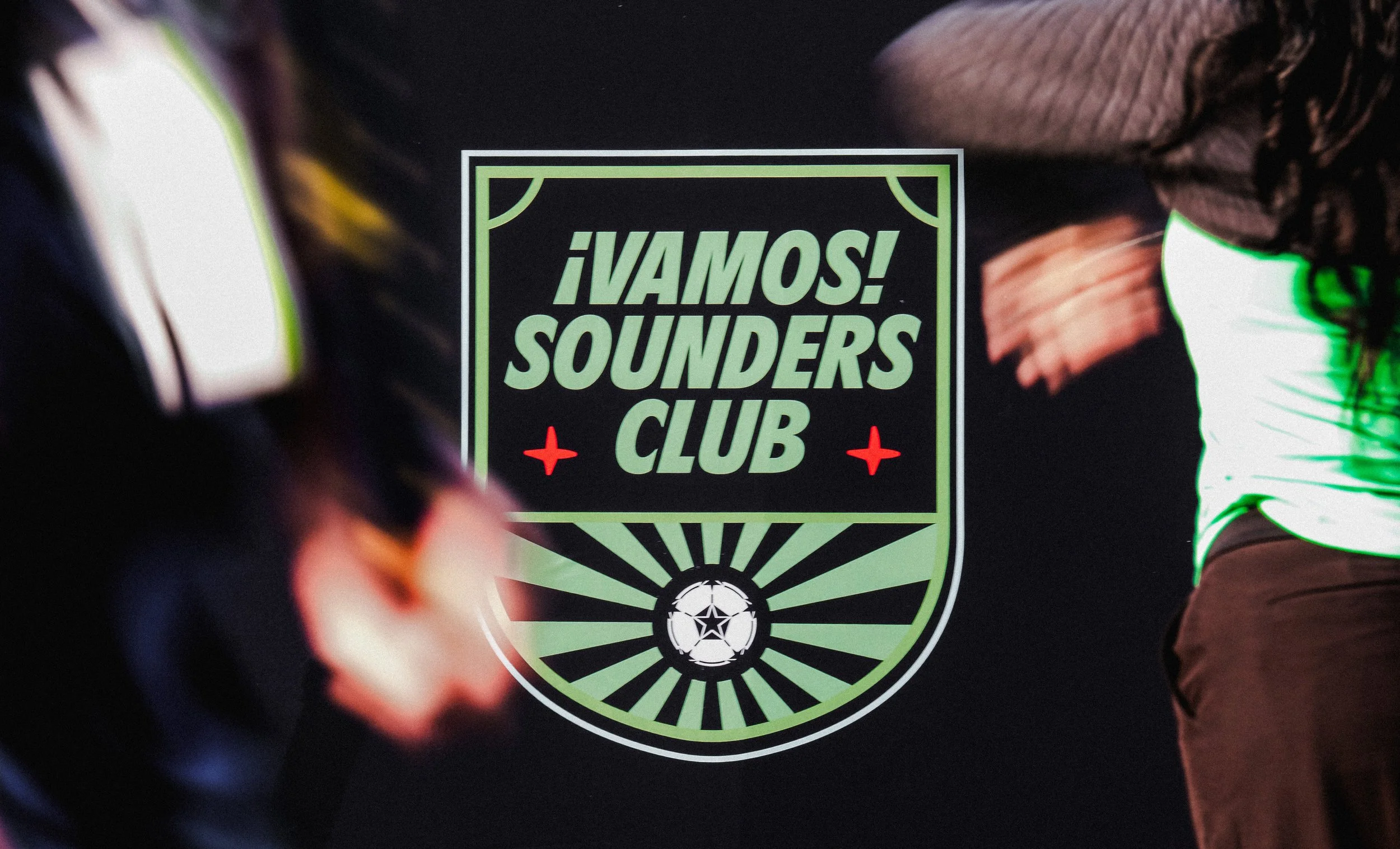
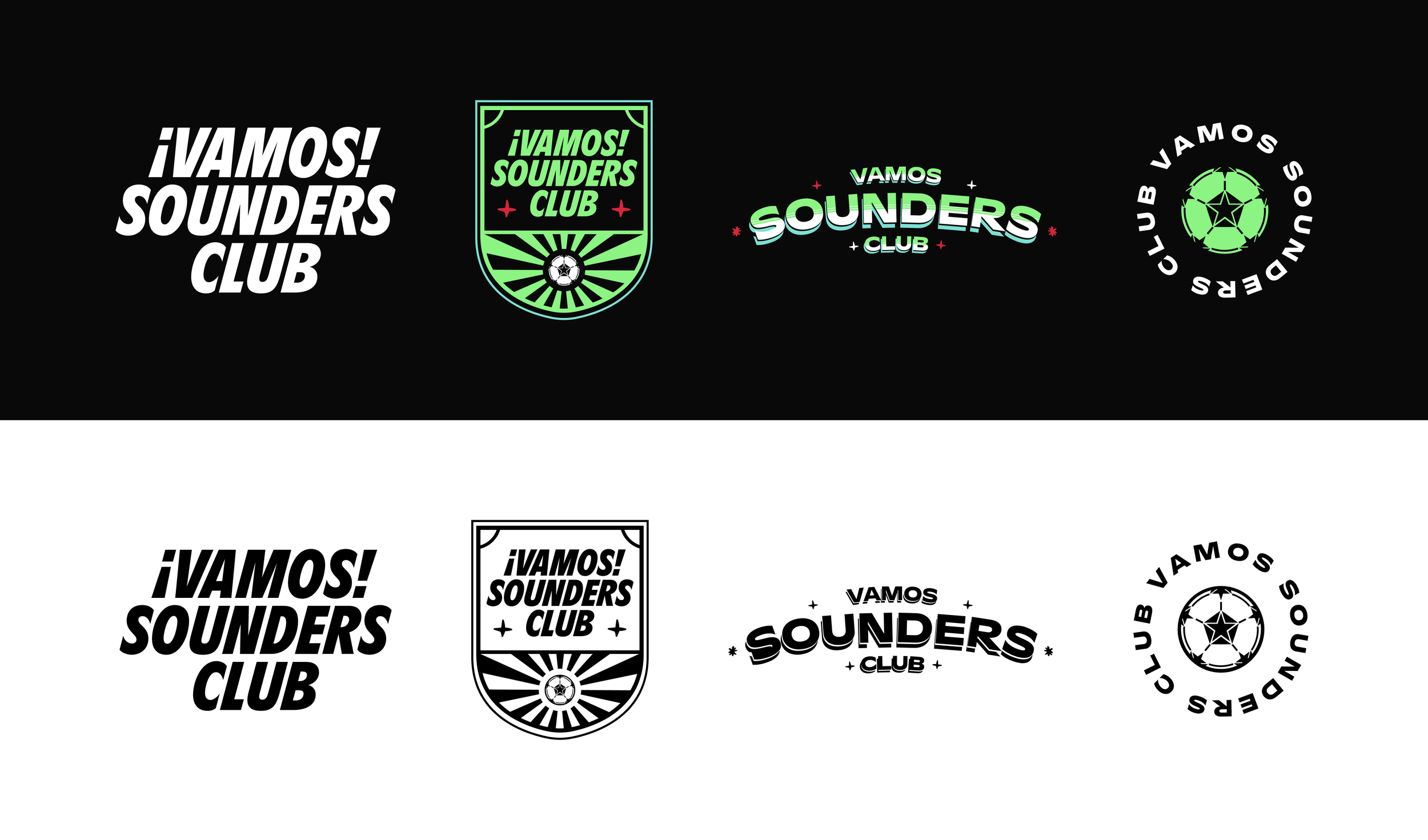
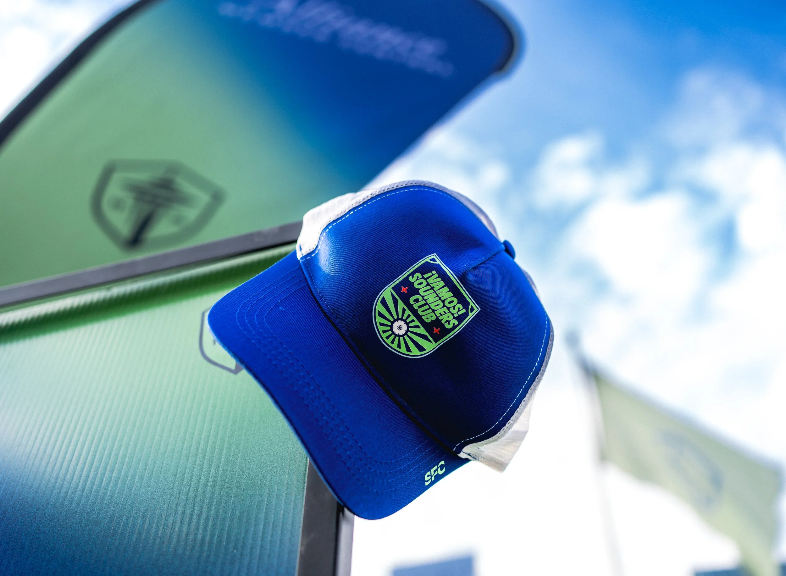
Logo System
We built a flexible logo system designed to scale across platforms, featuring the primary crest, wordmark, and tertiary marks.
Primary Crest:
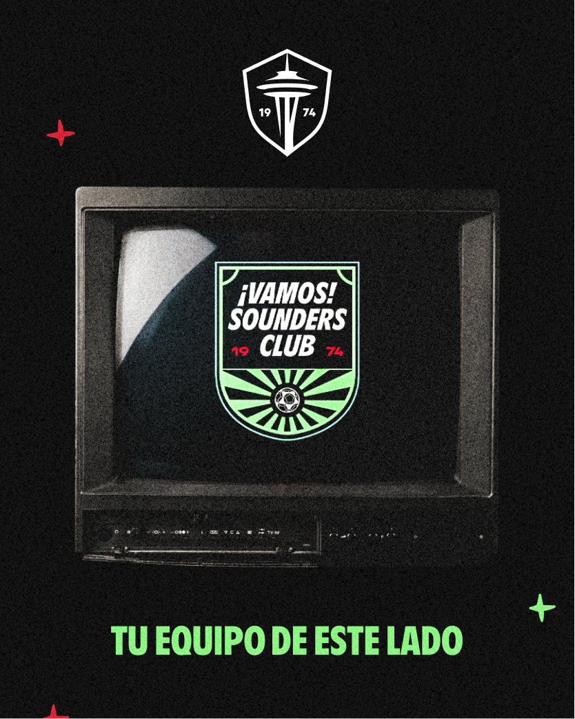
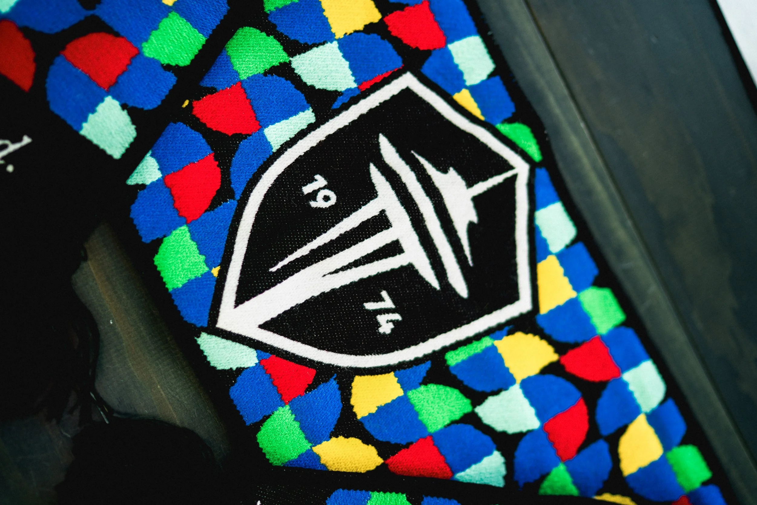
A half-rounded shield built around the wordmark as the primary point of hierarchy. The top corners reference the pitch through subtle corner-kick angles, while the lower half features the original 1974 Sounders ball—an homage to the club’s beginnings and the era that inspired this brand expression. The ball is paired with a sun ray, adding another layer of symbolism tied to our origins and the foundation of the club.
Wordmark:
Designed as an evergreen mark, the wordmark serves as the most flexible and scalable expression of the brand. It was built to work seamlessly in different applications while maintaining clarity, consistency, and strong recognition at any size.
The Bodega Mark:
Inspired by family-owned bodegas and neighborhood shops, this mark draws from the hand-painted signs often seen on walls and storefronts. It captures a sense of familiarity, craft, and community—places that feel lived-in, personal, and central to everyday life.
Heritage Seal Mark:
Featuring the 1974 ball paired with the circular “Vamos Sounders Club” typography, this mark was created for more minimal and refined applications. Its circular format makes it highly versatile, lending itself well to formal assets, subtle branding moments, and secondary placements without losing identity.
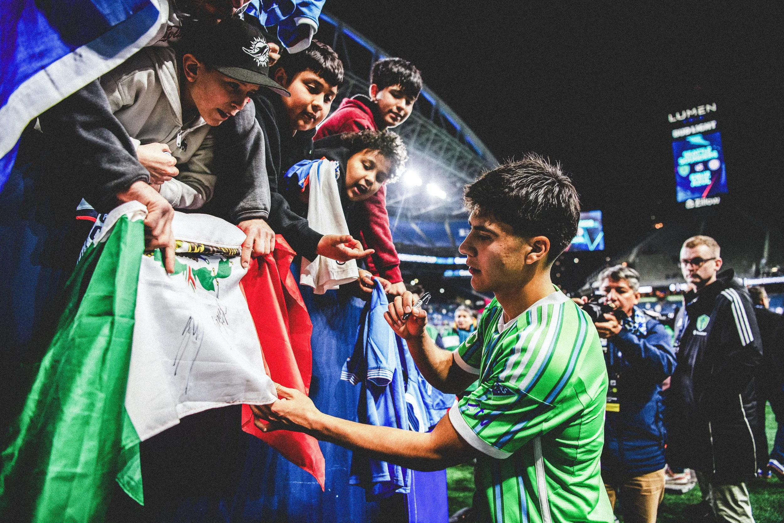
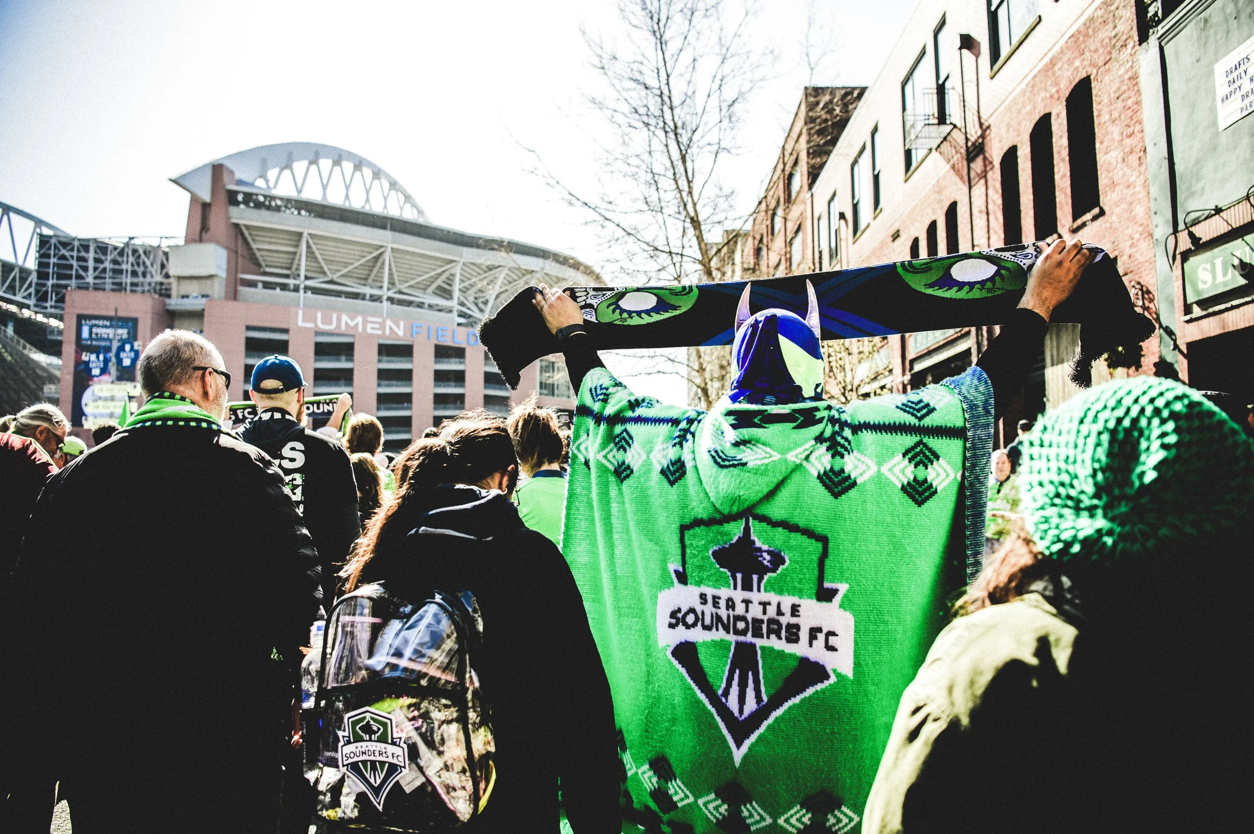
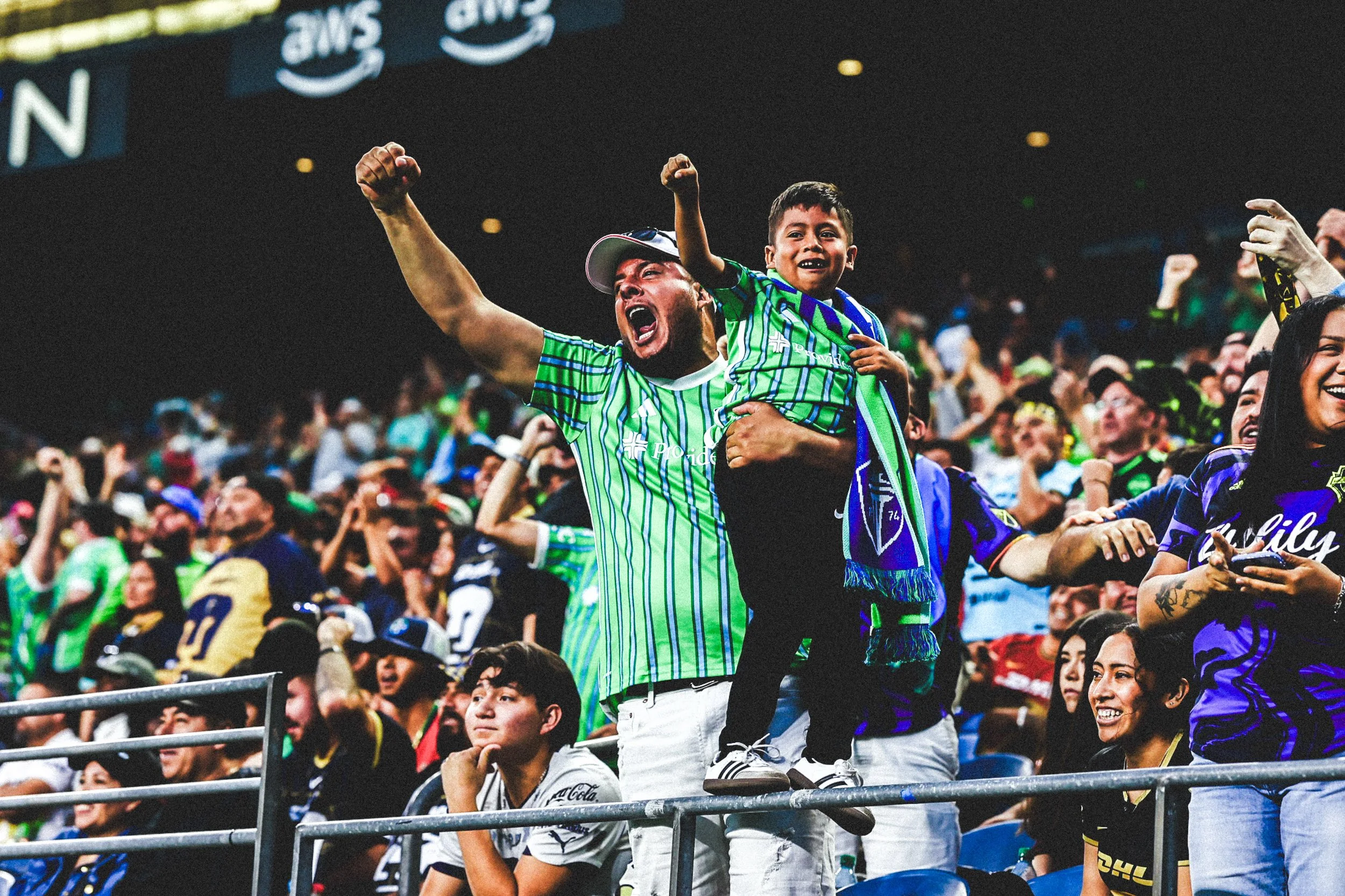
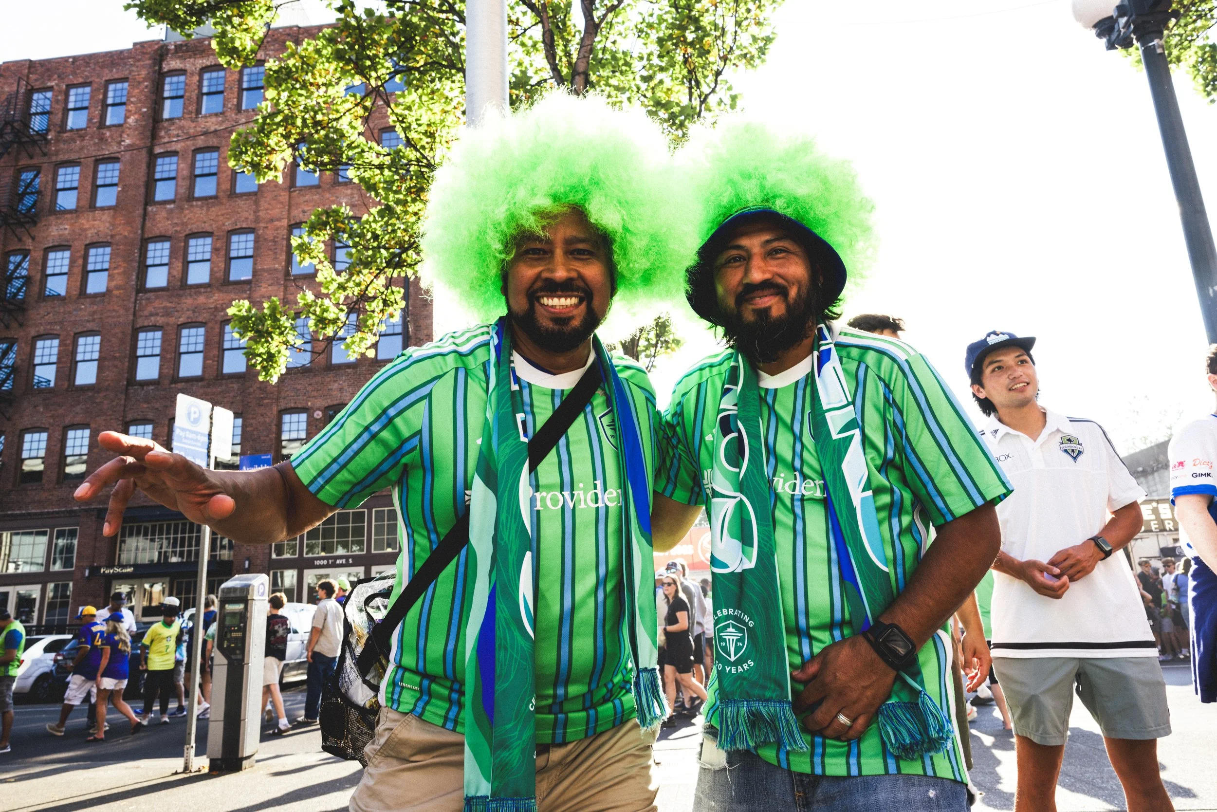
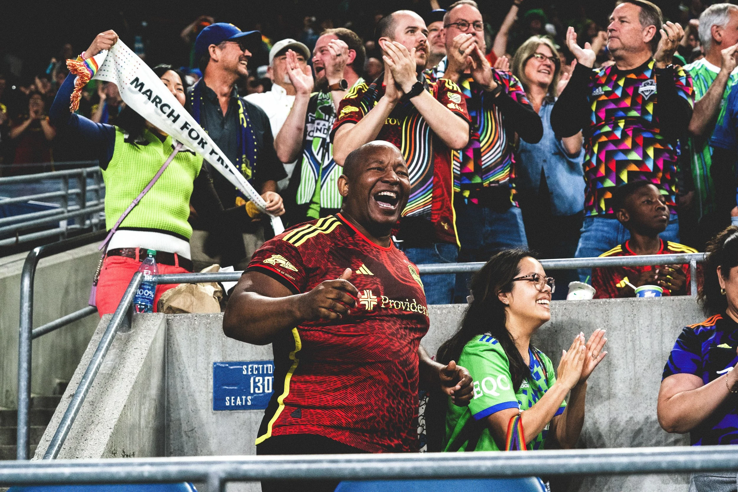
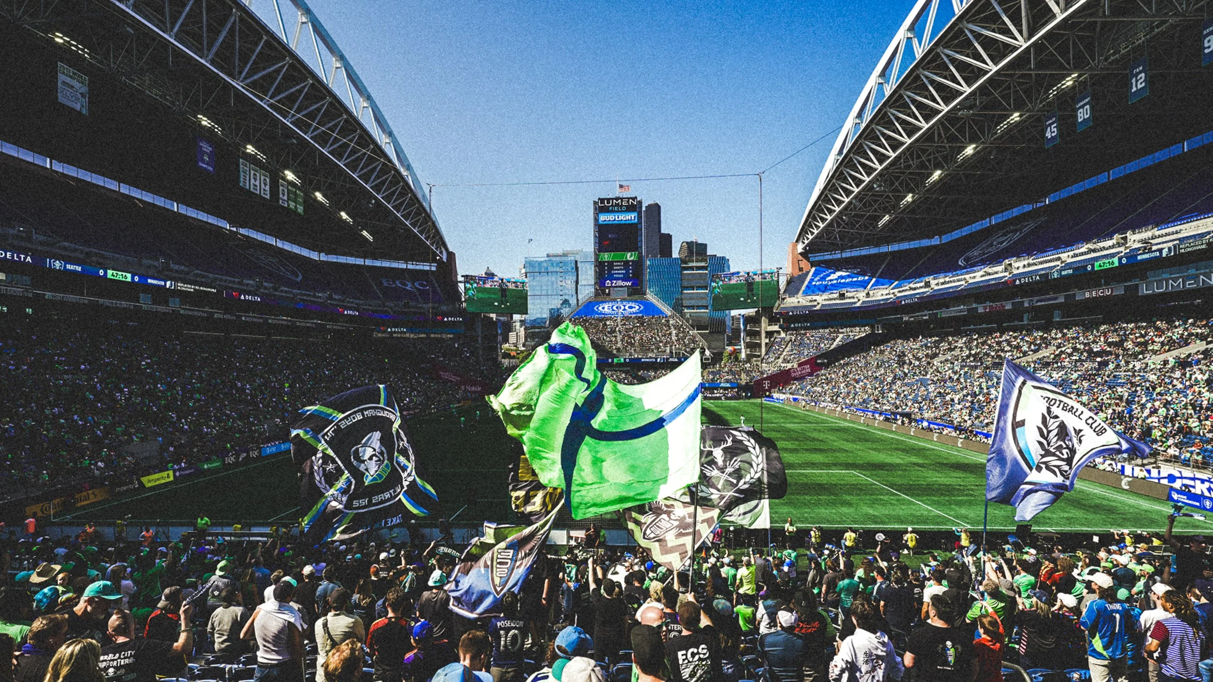
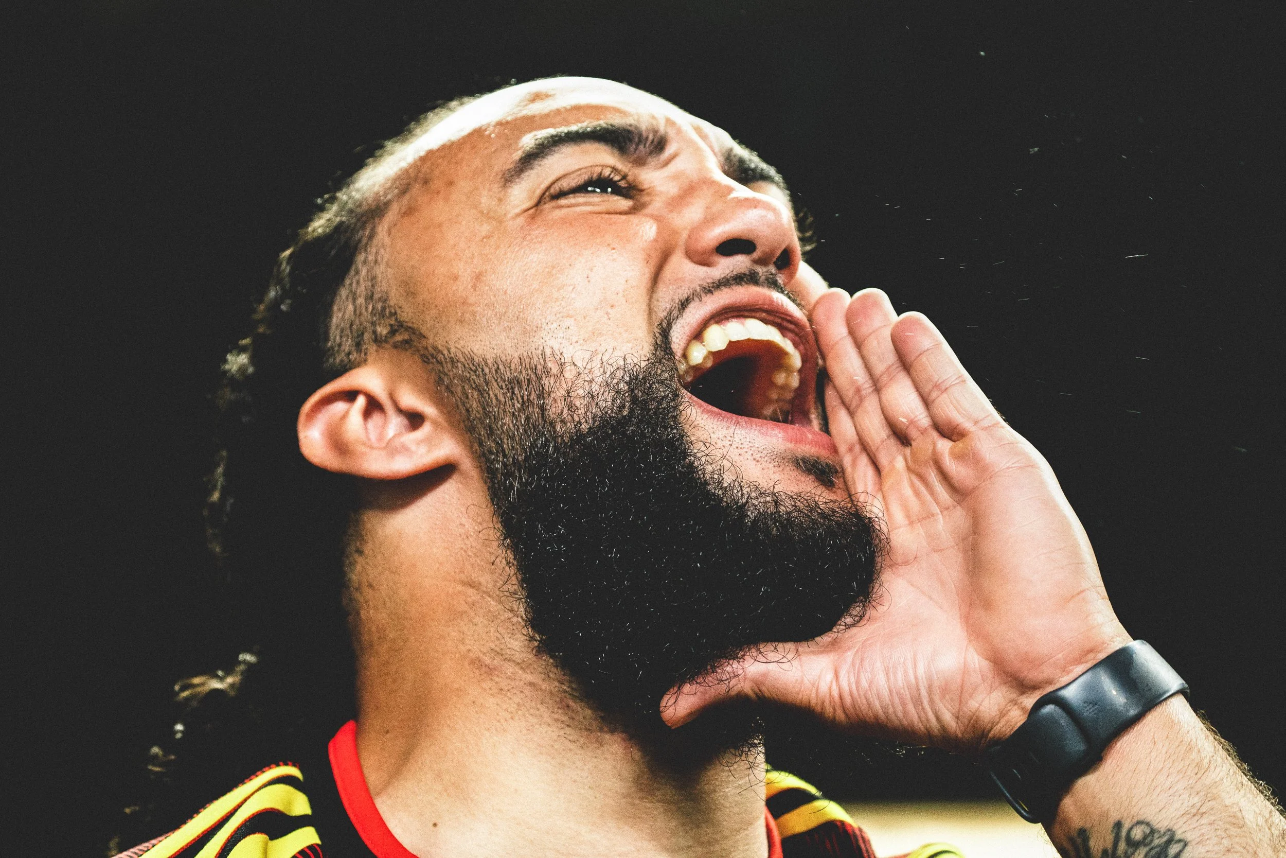
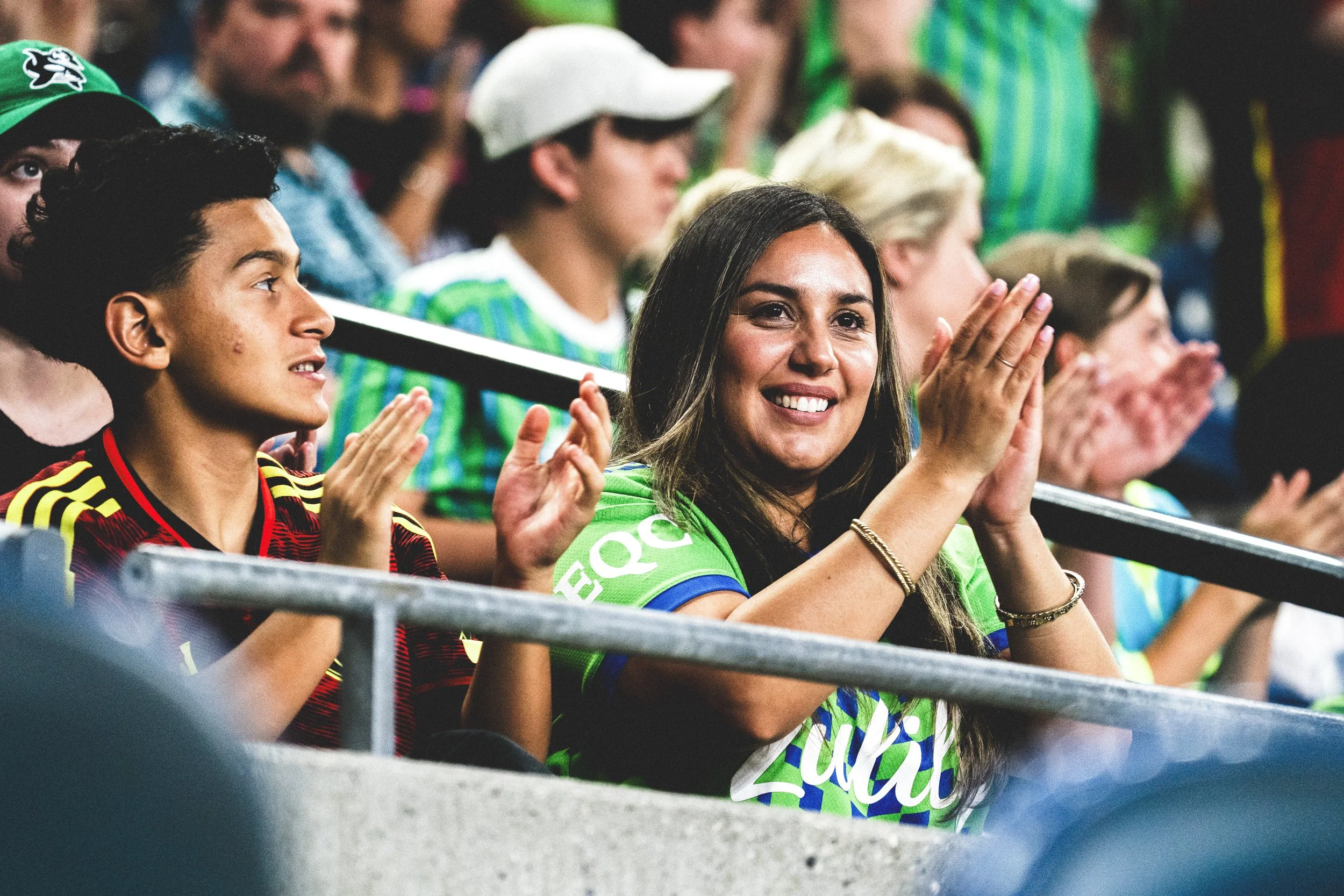
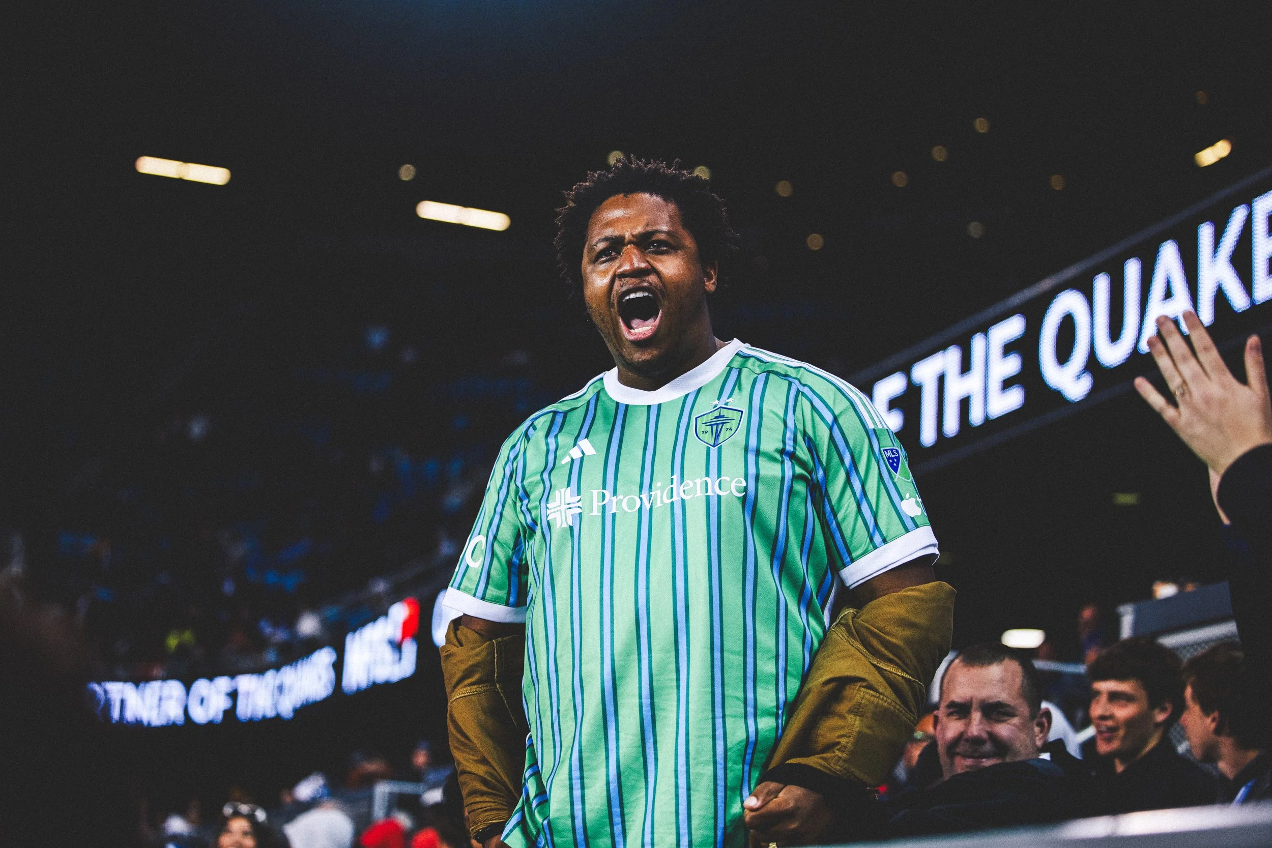
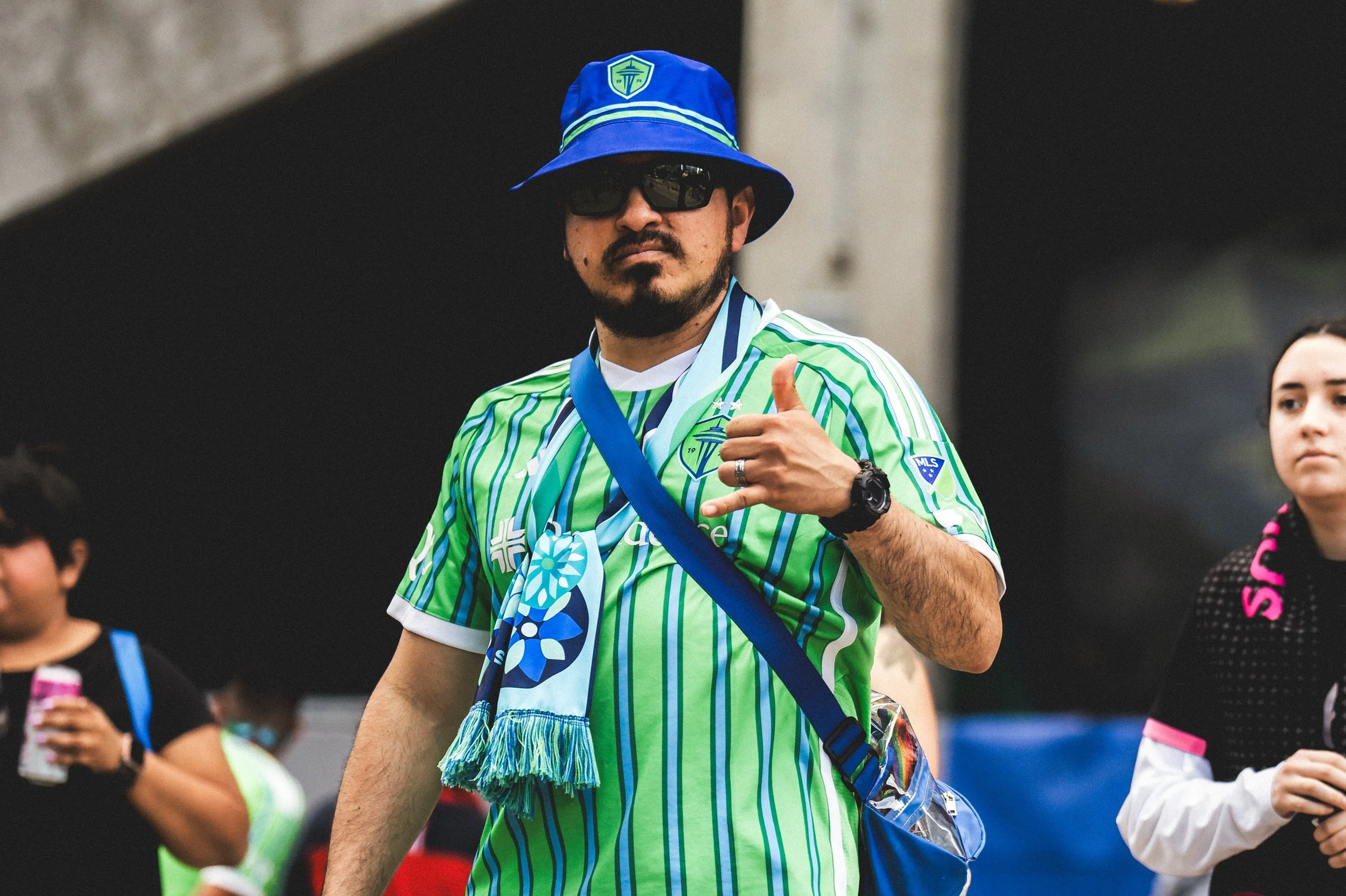
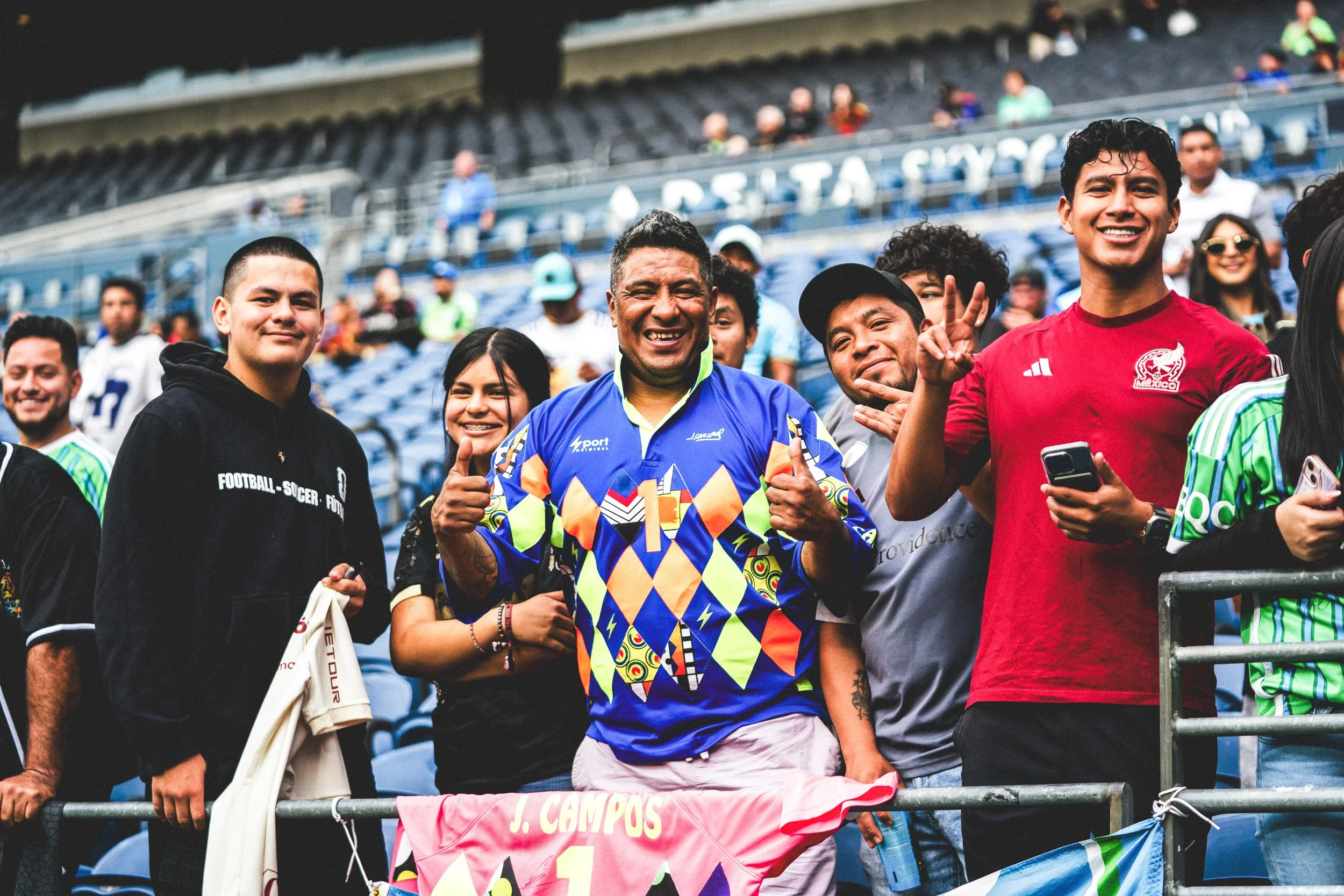
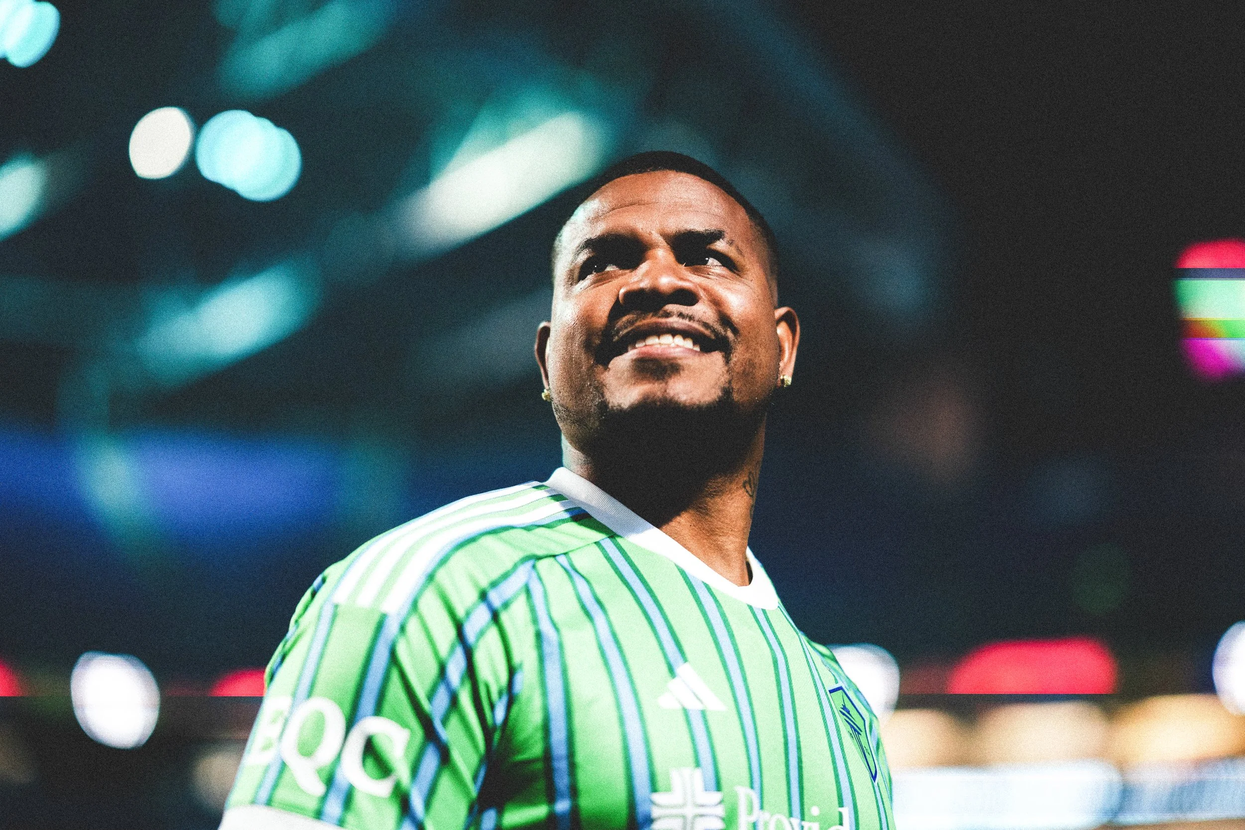
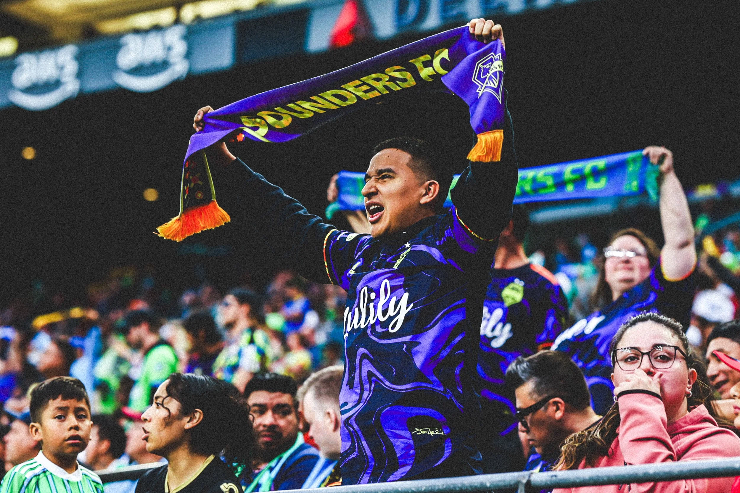
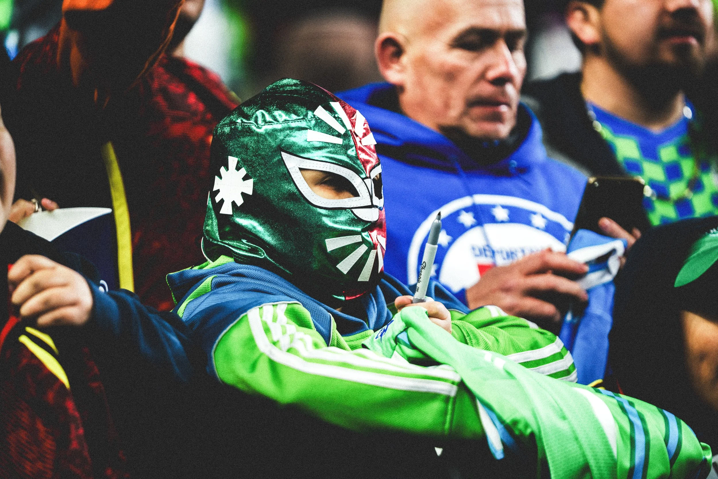
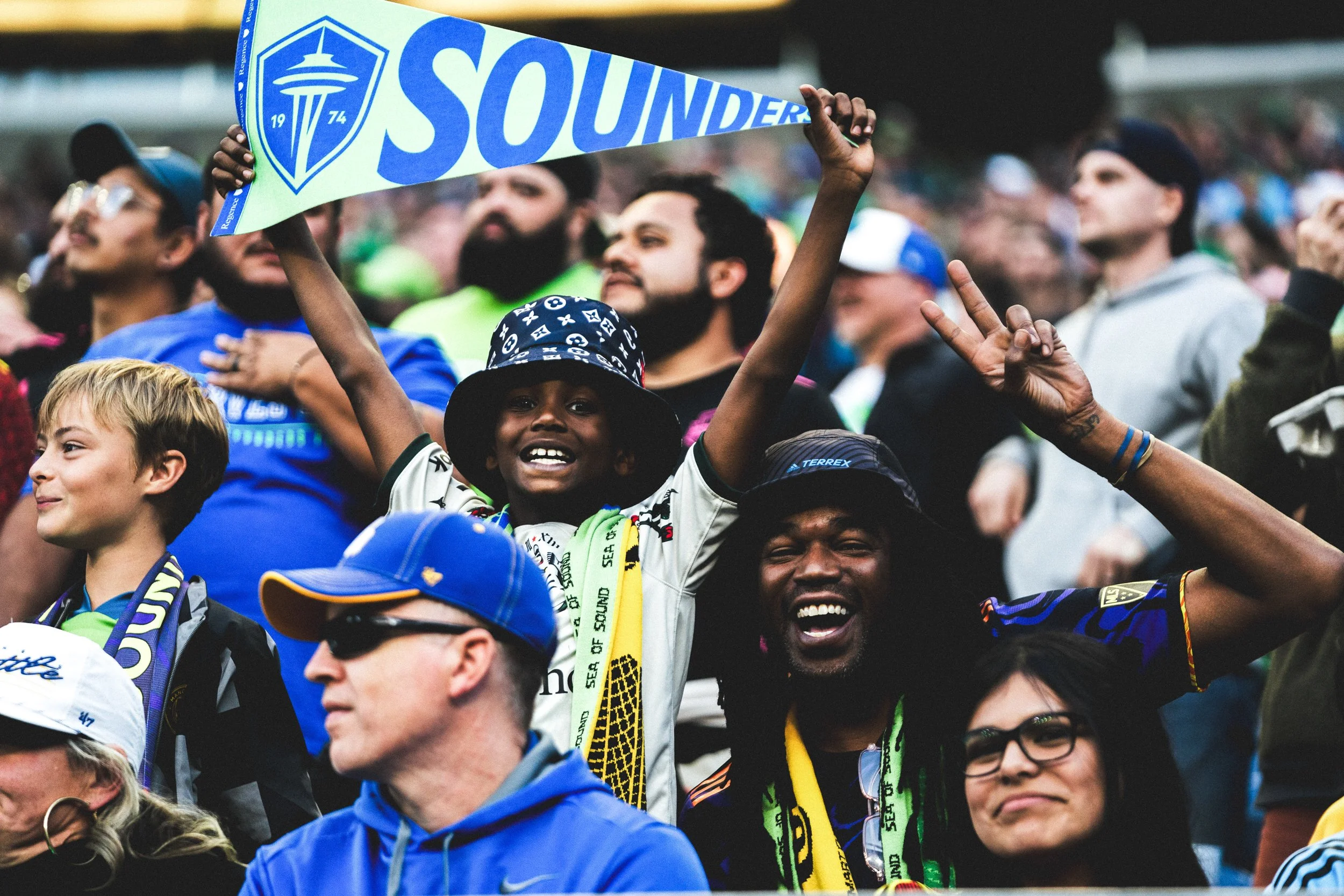
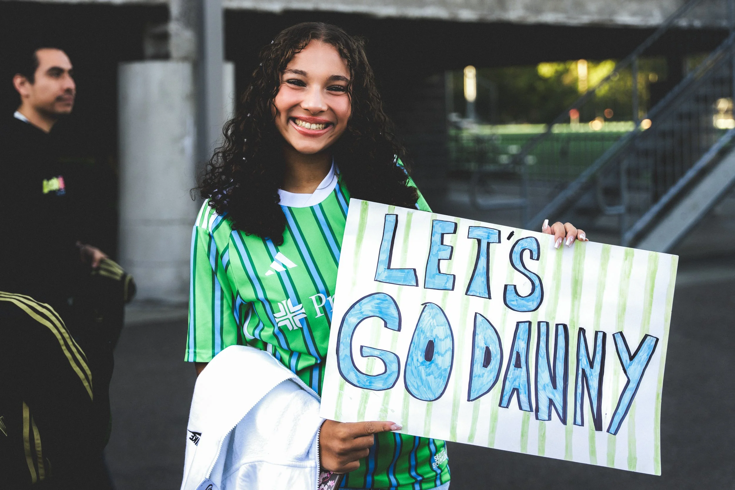
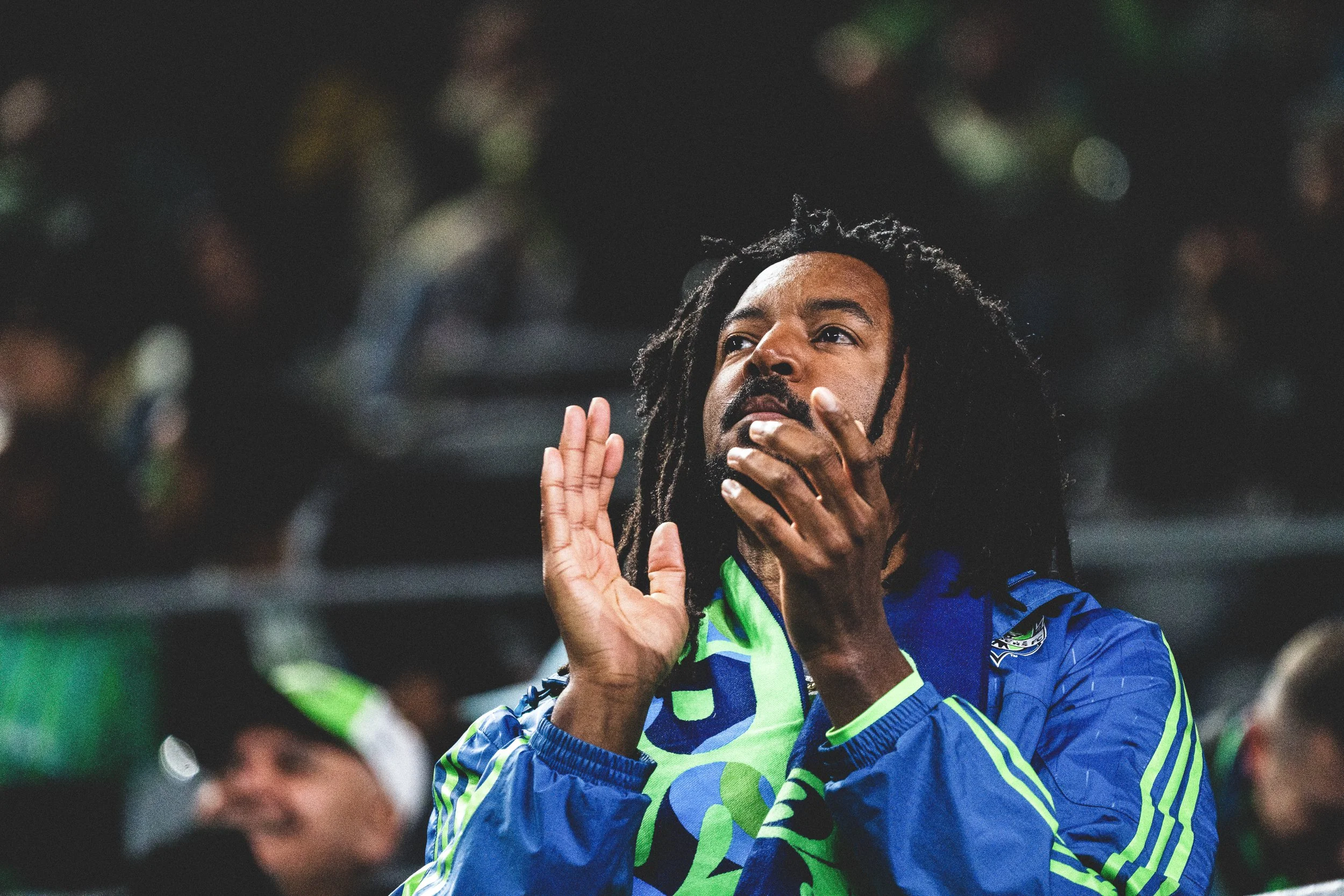
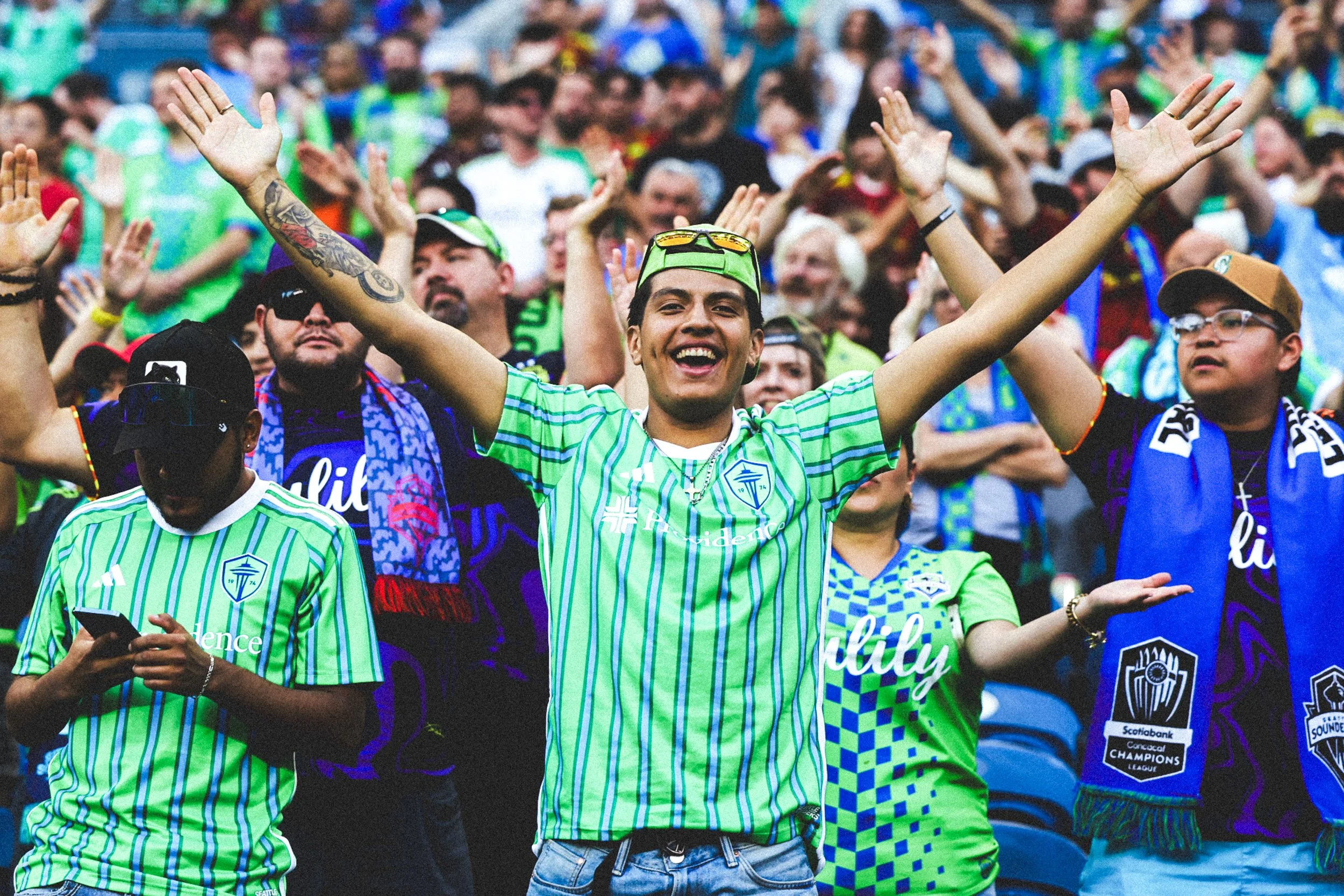
Imagery
Photography plays a key role in how the brand shows up. This collection highlights the visual tone we’re aiming for —capturing mood, energy, and perspective—to guide future photography while leaving room for authenticity and real moments.
Visual Concepts
These are a series of visual concept graphics that show how the brand can come to life through social content, helping set the tone for how it communicates visually across digital platforms.
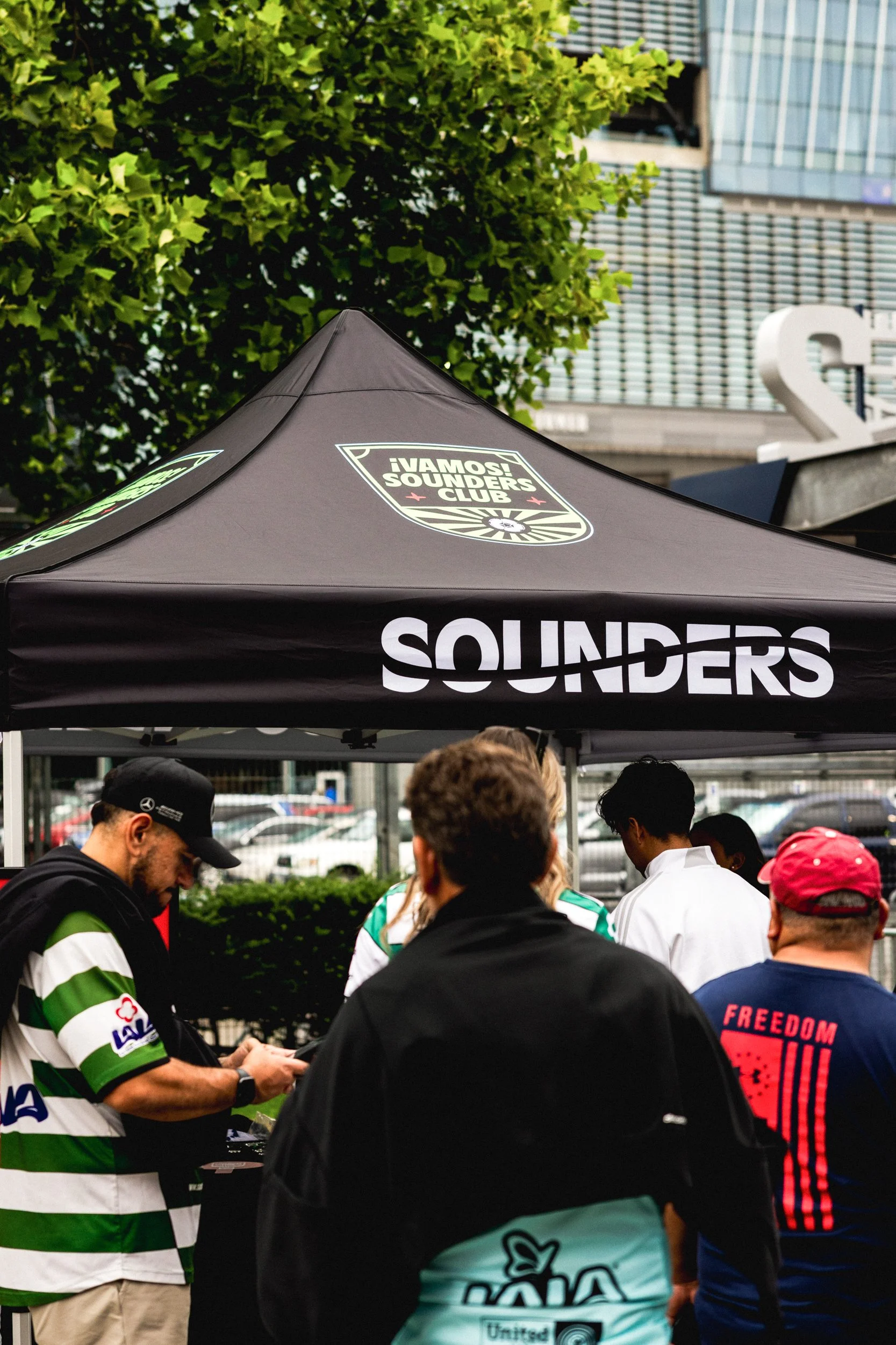
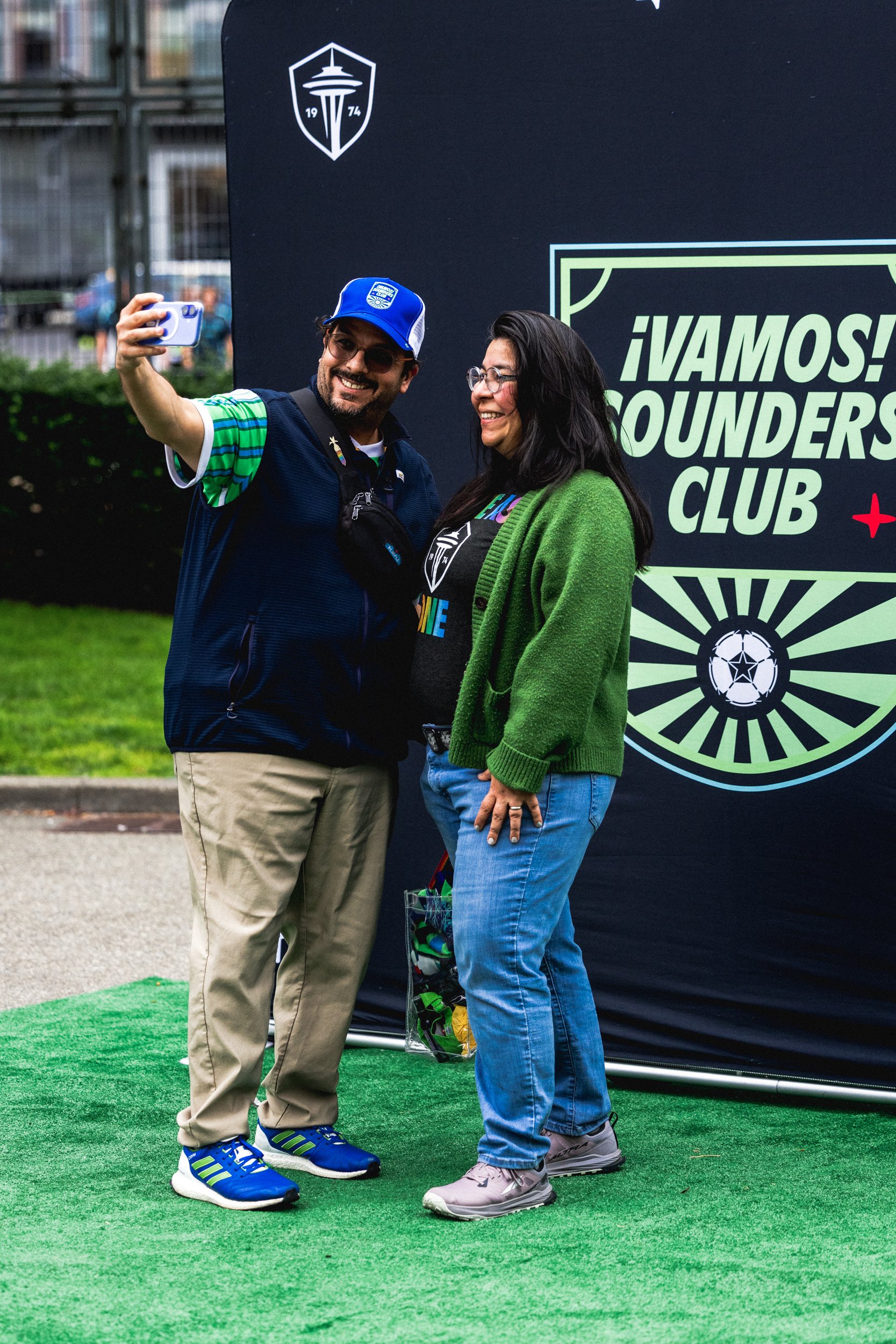
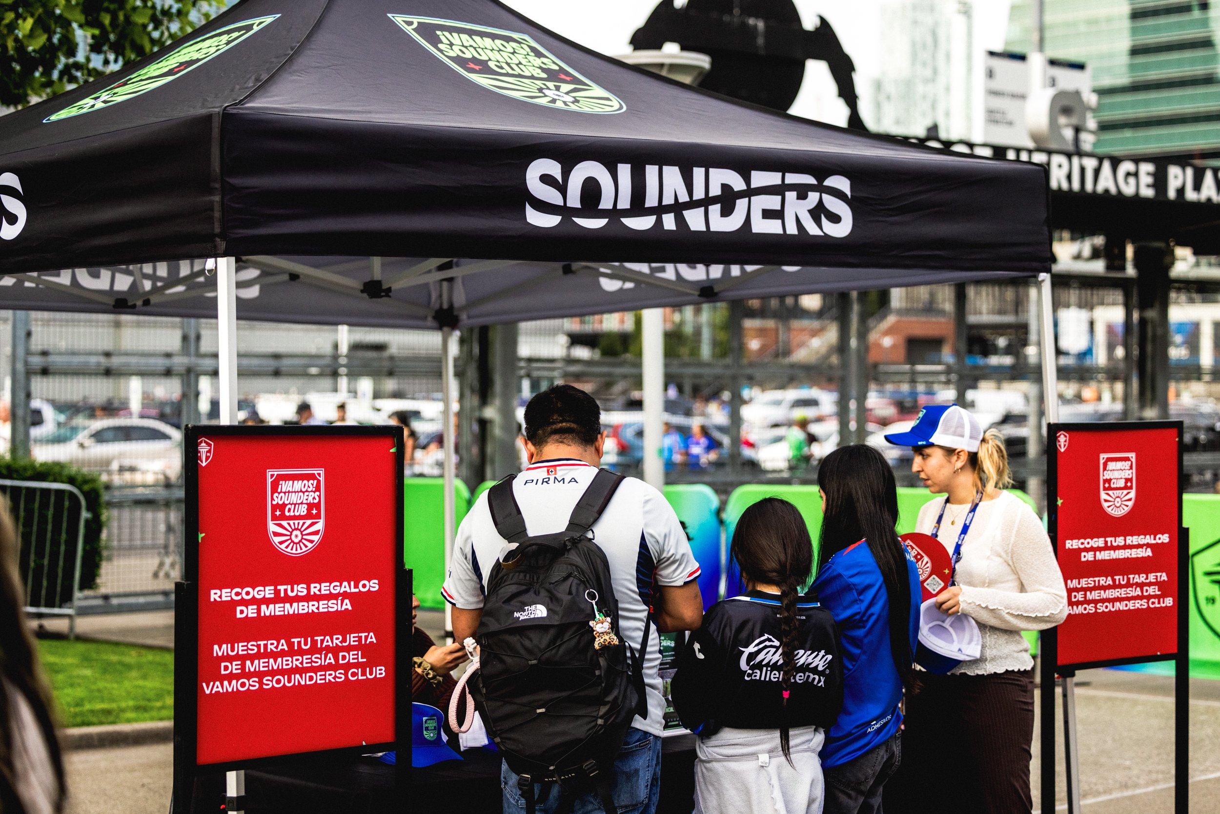
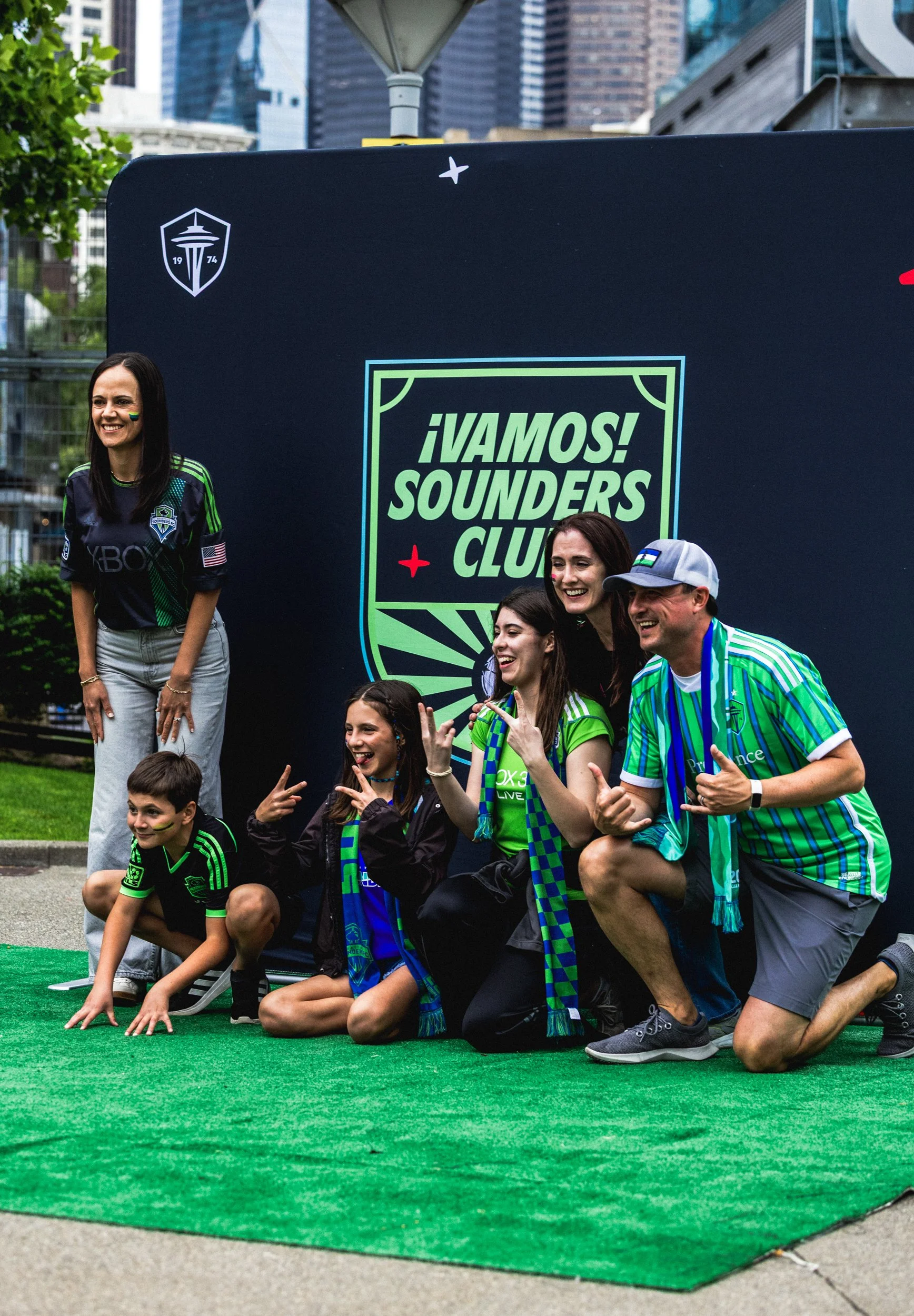
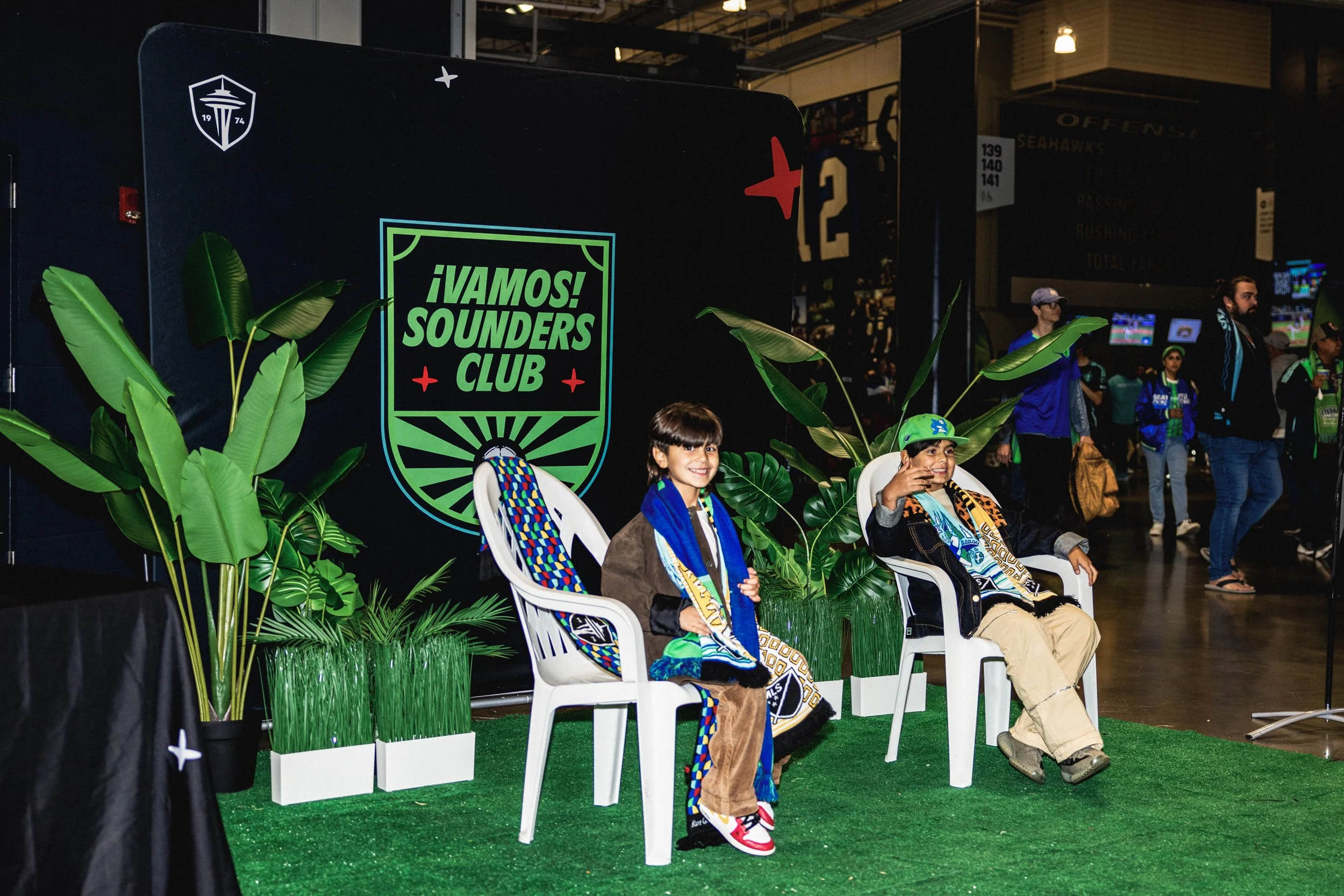
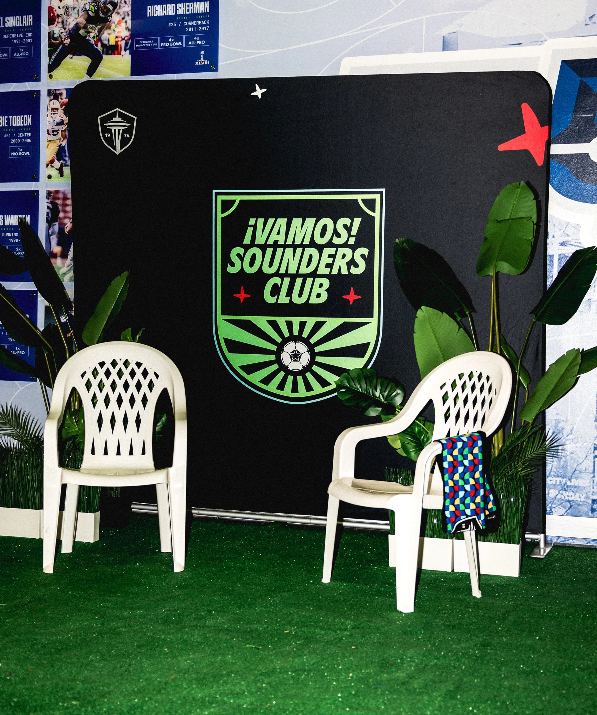
In-Stadium Activations
Registration tent, hat giveaway and the inspired “Debí Tirar Más Fotos” Bad Bunny Photo Station
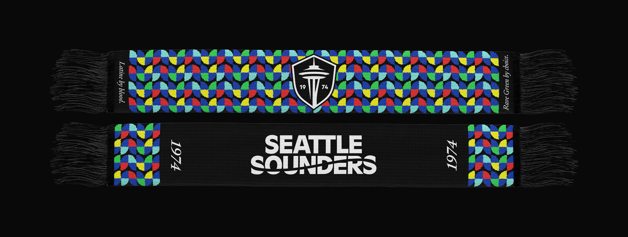
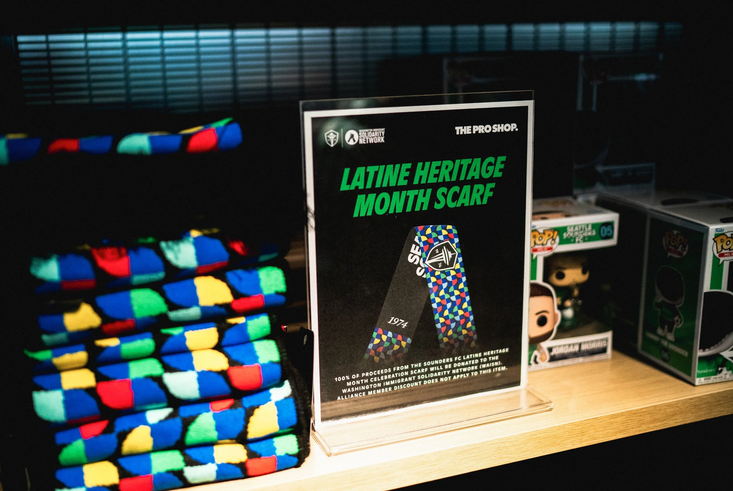
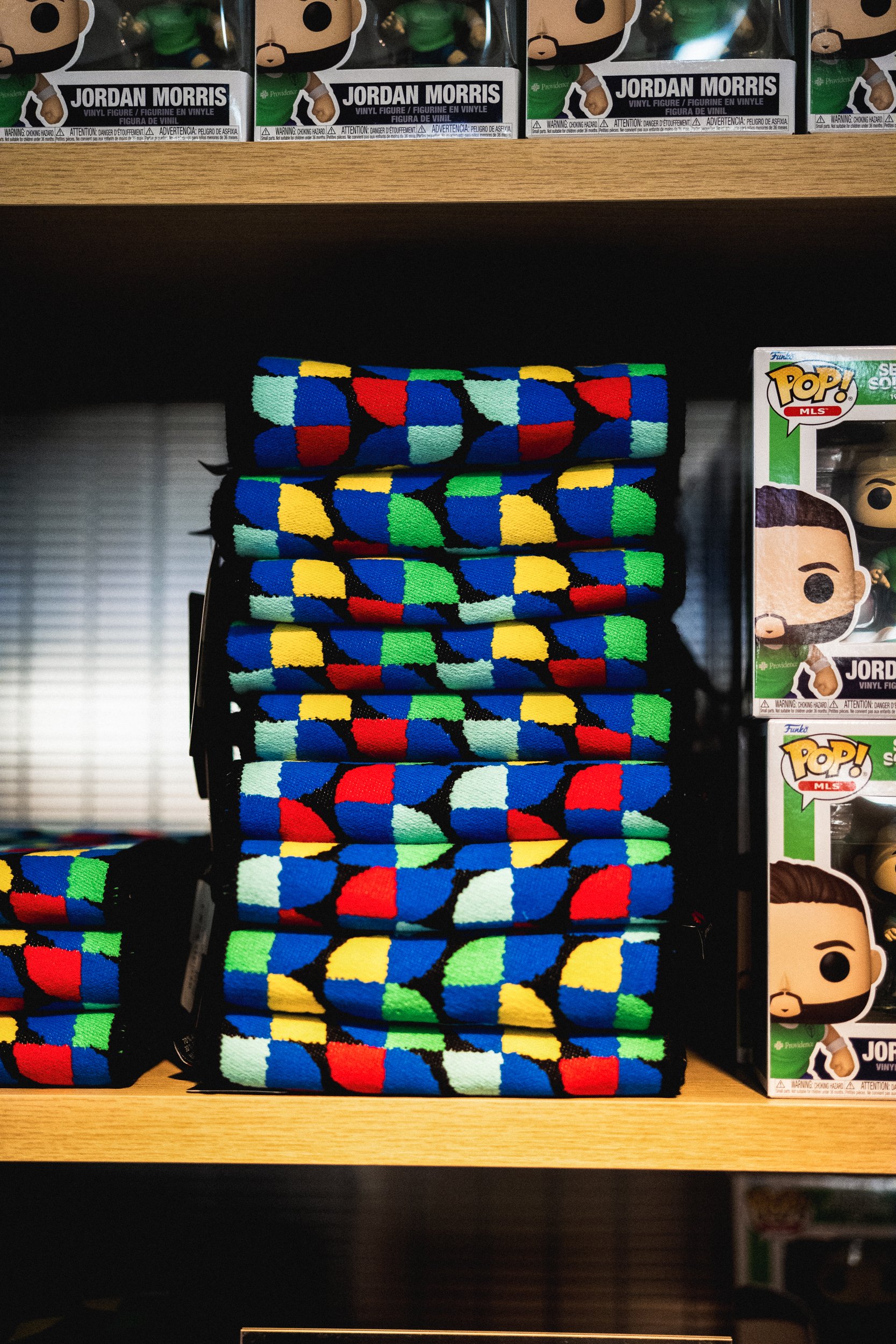
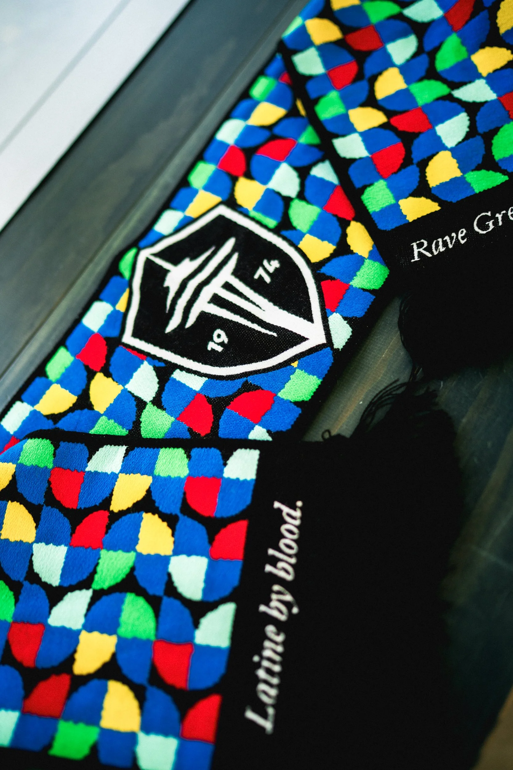
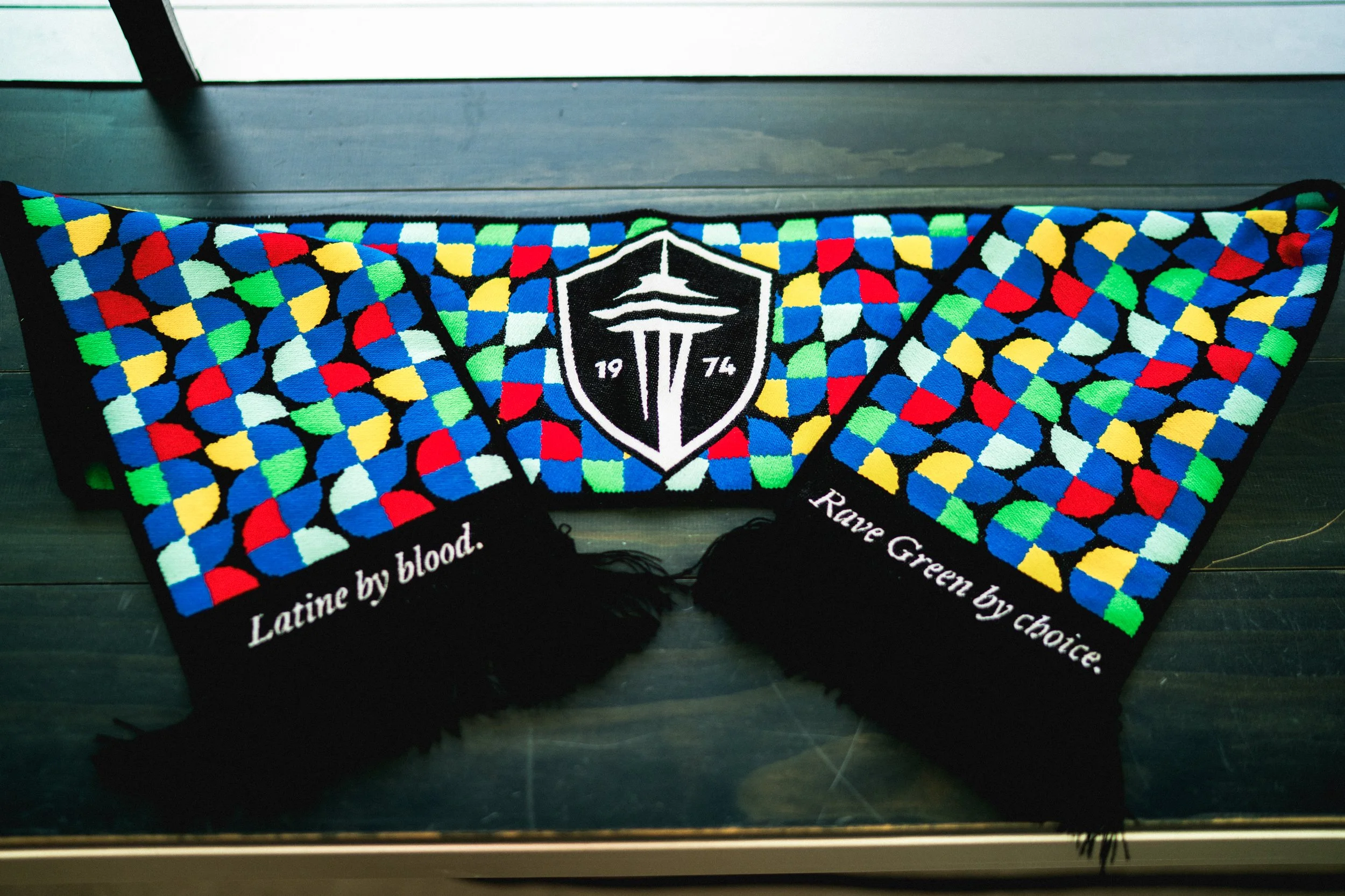
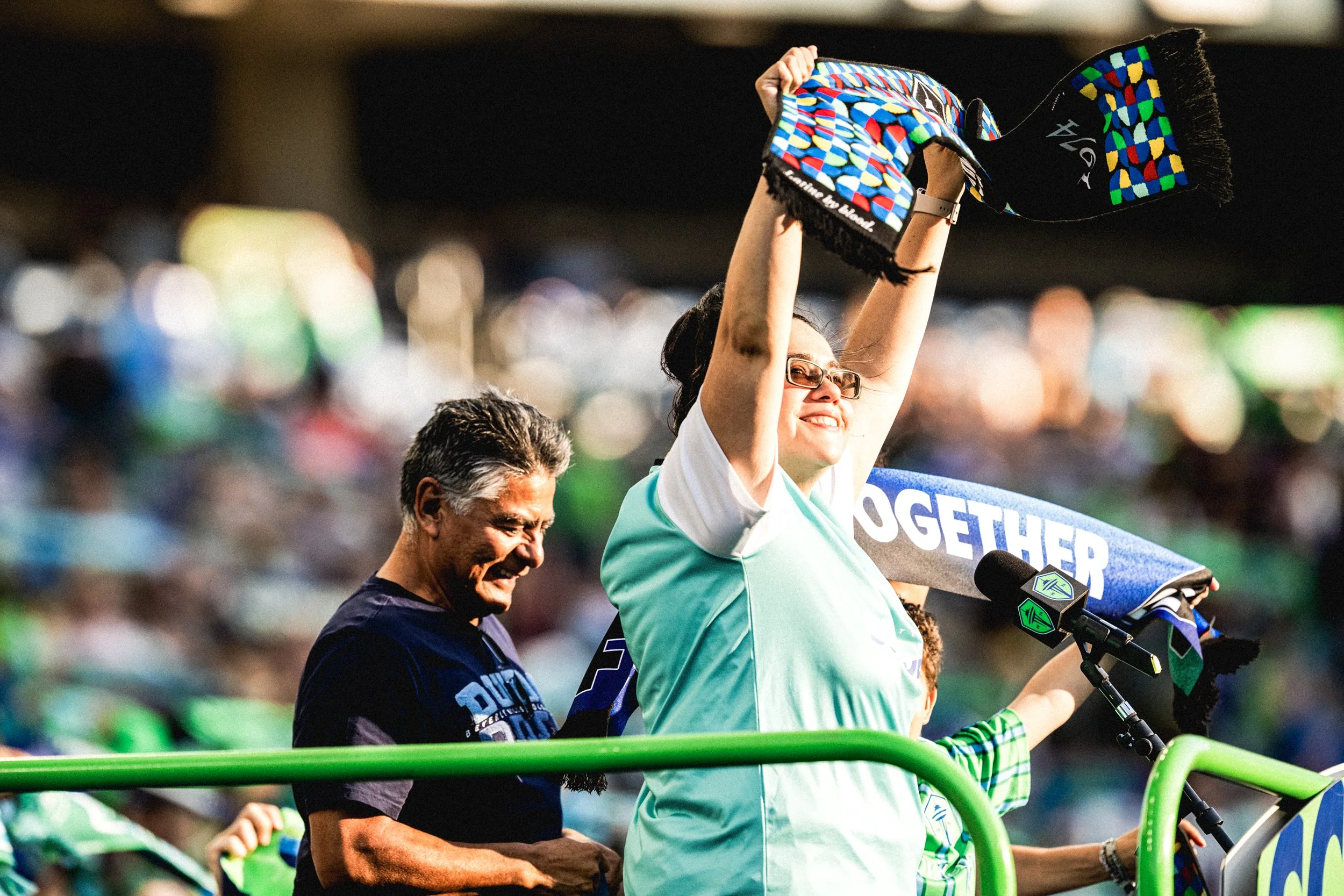
Heritage Scarf
The Heritage Scarf was created for Hispanic Heritage Month as a way to deepen our connection with the community through Vamos Sounders Club. The design is rooted in a grid and mosaic system—something you see everywhere across Latin America, from churches and public art to city streets and everyday spaces. It’s a visual language that feels familiar, warm, and lived in.
That became the foundation for the scarf: an abstract mosaic built from the primary colors of Latin American flags. Each square was carefully shaped to connect with the ones around it, forming subtle flower patterns across the entire piece—small details that come together to tell a bigger story of culture, unity, and pride.
All of the proceeds were donated to Washington Immigrant Solidarity Network, through RAVE Foundation.
Impact, Insights & Contributors
📈 RESULTS
The response to Vamos Sounders Club was overwhelmingly positive. We exceeded our goals for registrations and fan acquisition, and most importantly, the sense of community we set out to build really landed. For many in the Latino community, this was the first time they felt officially seen and celebrated by the club, and that mattered. Feedback from internal stakeholders, focus groups, and fans showed that the work succeeded not just in driving growth, but in creating something people felt proud to belong to and be represented by.
💡 KEY LEARNINGS
Getting into focus groups and hearing directly from fans—their stories, their needs, their hopes—was one of the most meaningful parts of this project. It reinforced something I truly believe: especially in community-driven work, you have to listen before you create. Those voices didn’t just inform the work, they shaped it.
🤝 TEAM
Rob Stanton // Creative Director
Christian Vargas // Graphic Designer
🎨 MY CONTRIBUTIONS
I co-led the creative direction for the project and led the design execution across the full brand identity. I also designed the Heritage Scarf and collaborated closely with Christian Vargas to bring the entire identity to life.
Sammy The Sounder